Branding Lilea
Branding, 2022
Project Description
Brand Identity for LILEA
Client
LILEA - Associazione APS degli Ucraini Toscani a Firenze
Role
Graphic Designer
Project Overview
LILEA, which means "Giglio" (lily) in Ukrainian, is a non-profit organization dedicated to fostering connections between Ukraine and Italy, with a special focus on the Ukrainian community in Tuscany, Italy. My role as a graphic designer was to develop a brand identity that encapsulates the organization's mission of building bridges between these two cultures.
Objective
The primary objective was to create a visual identity that harmoniously combines elements of Ukrainian culture with symbols representative of Florence, the heart of Tuscany. This branding needed to resonate with both the Ukrainian and Italian communities, reflecting unity, cultural heritage, and mutual respect.
Inspiration and Concept
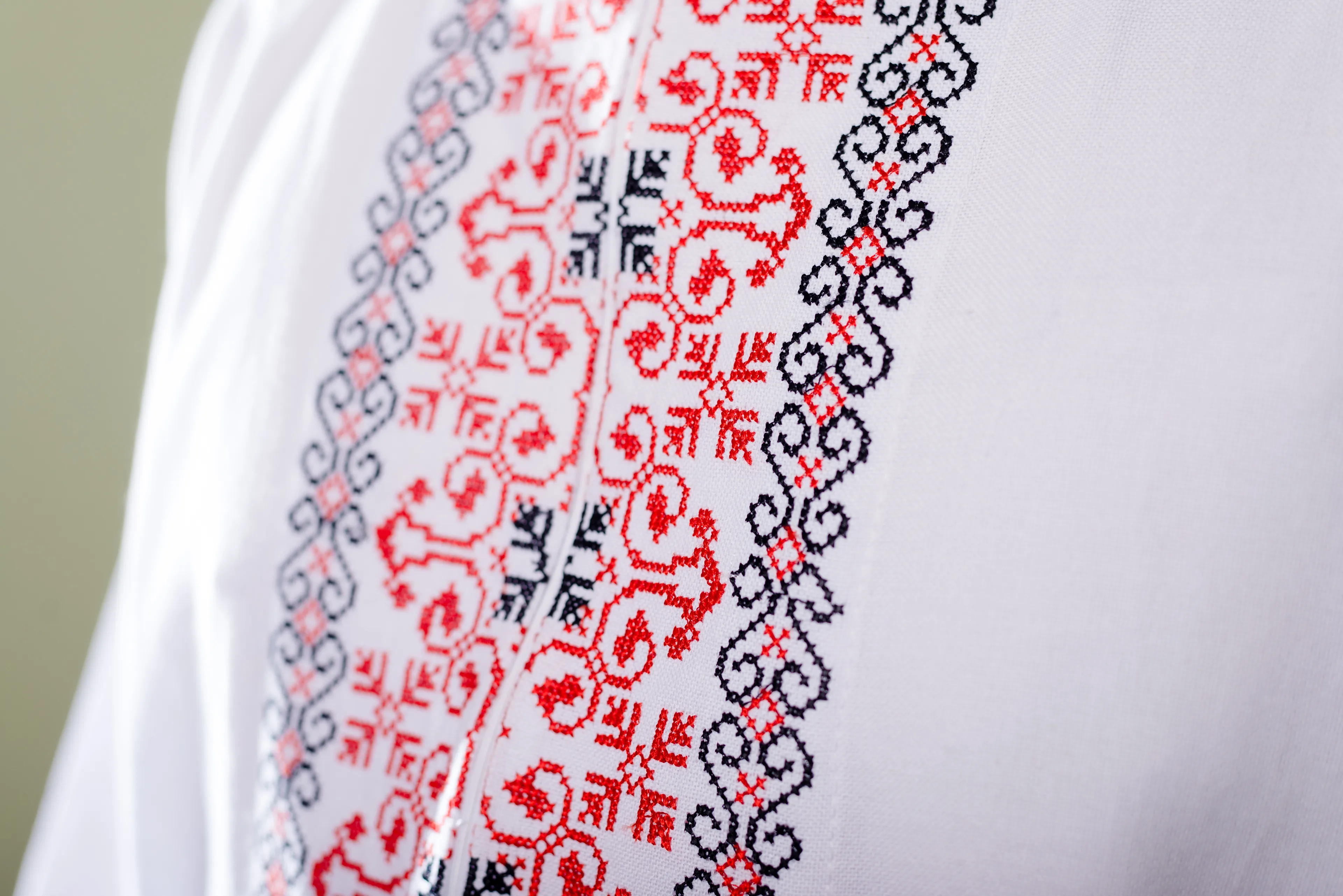
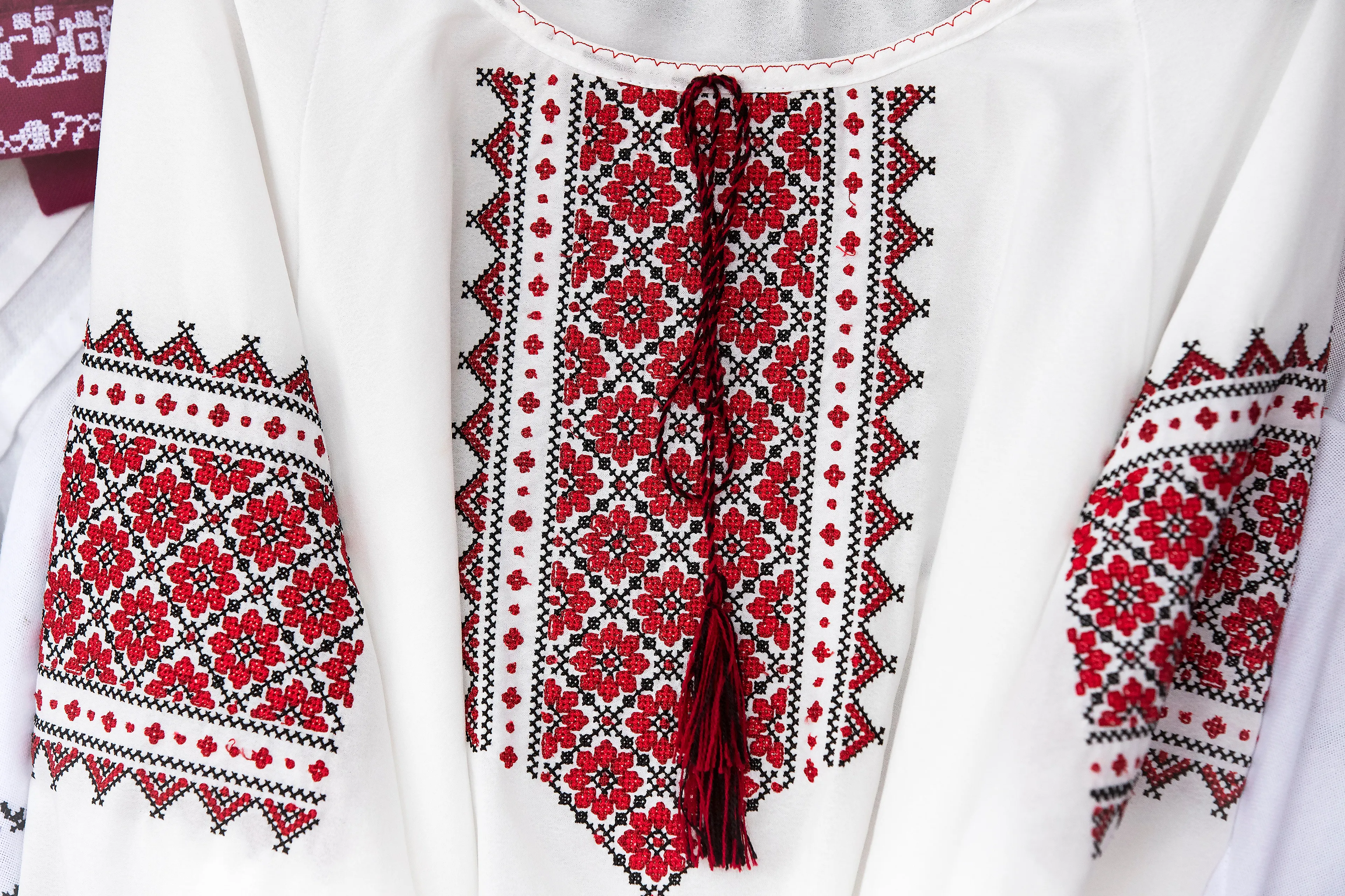
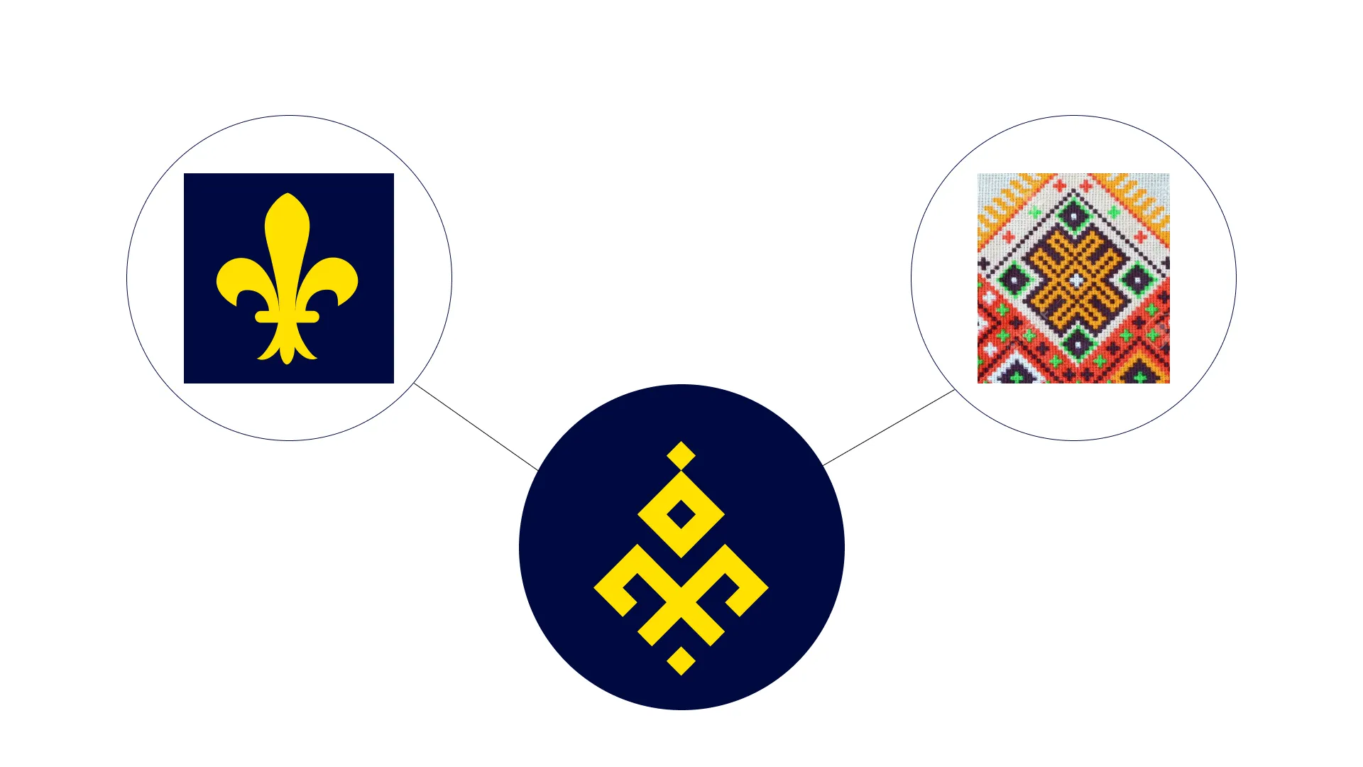
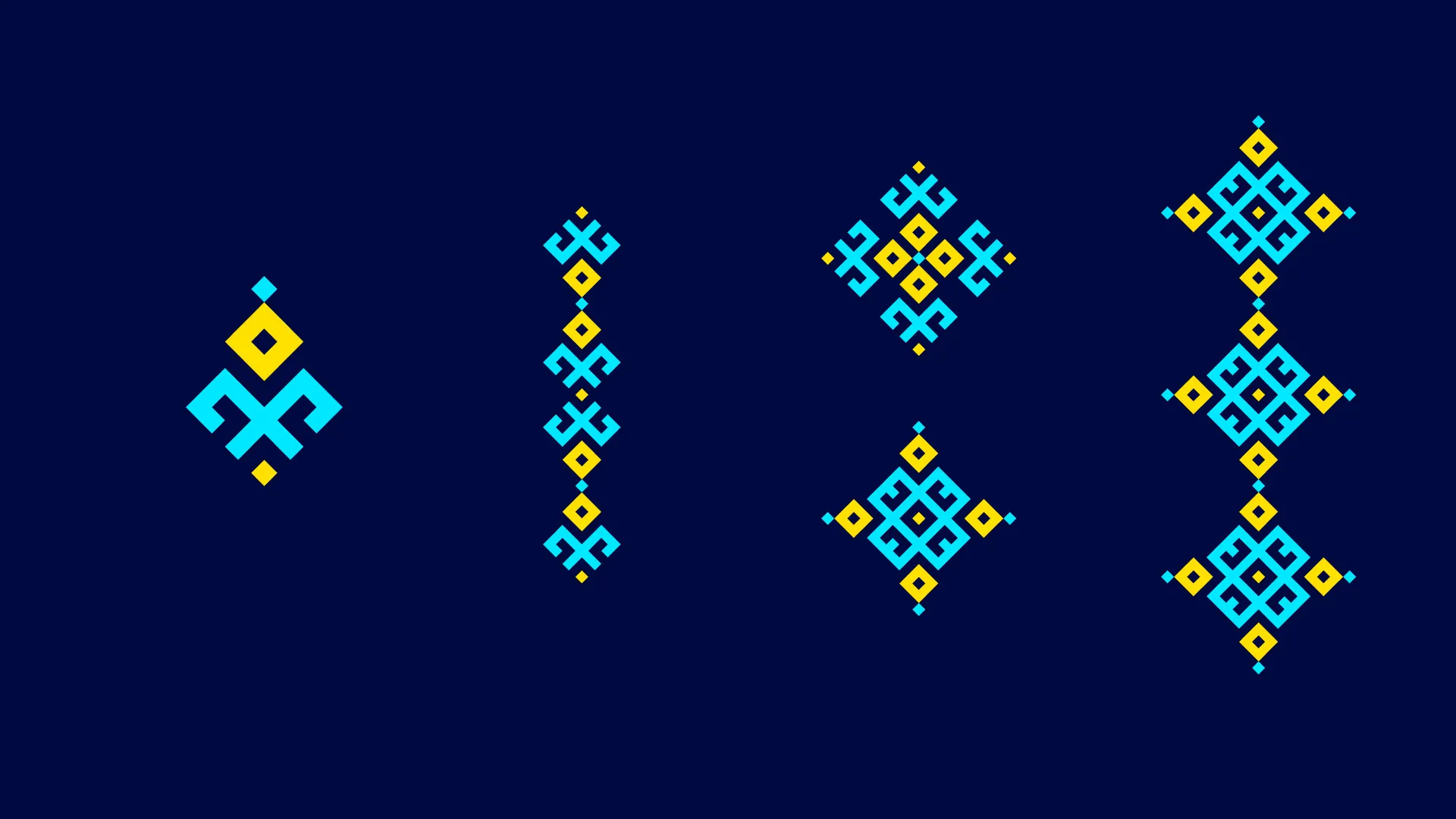
To achieve this, I drew inspiration from traditional Ukrainian textile patterns, known for their intricate and symbolic designs. These patterns are not only visually appealing but also carry deep cultural significance. The challenge was to merge these with the iconic "Giglio" (lily), a symbol closely associated with the city of Florence, aligning perfectly with the name "Lilea."
Design Process
Research and Exploration:
- Conducted in-depth research into Ukrainian textile patterns, focusing on their colors, shapes, and meanings.
- Studied the history and significance of the "giglio" symbol in Florentine culture.
Concept Development:
- Sketched initial ideas combining the Ukrainian patterns with the "giglio" shape.
- Experimented with various layouts and color schemes to find a harmonious blend of the two elements.
Design Execution:
- Created digital versions of the selected concepts using graphic design software.
- Fine-tuned the design to ensure clarity and visual appeal at various sizes and on different media.
Feedback and Refinement:
- Presented the initial designs to the LILEA board for feedback.
- Incorporated their suggestions and made necessary adjustments to perfect the final logo.
Final Design
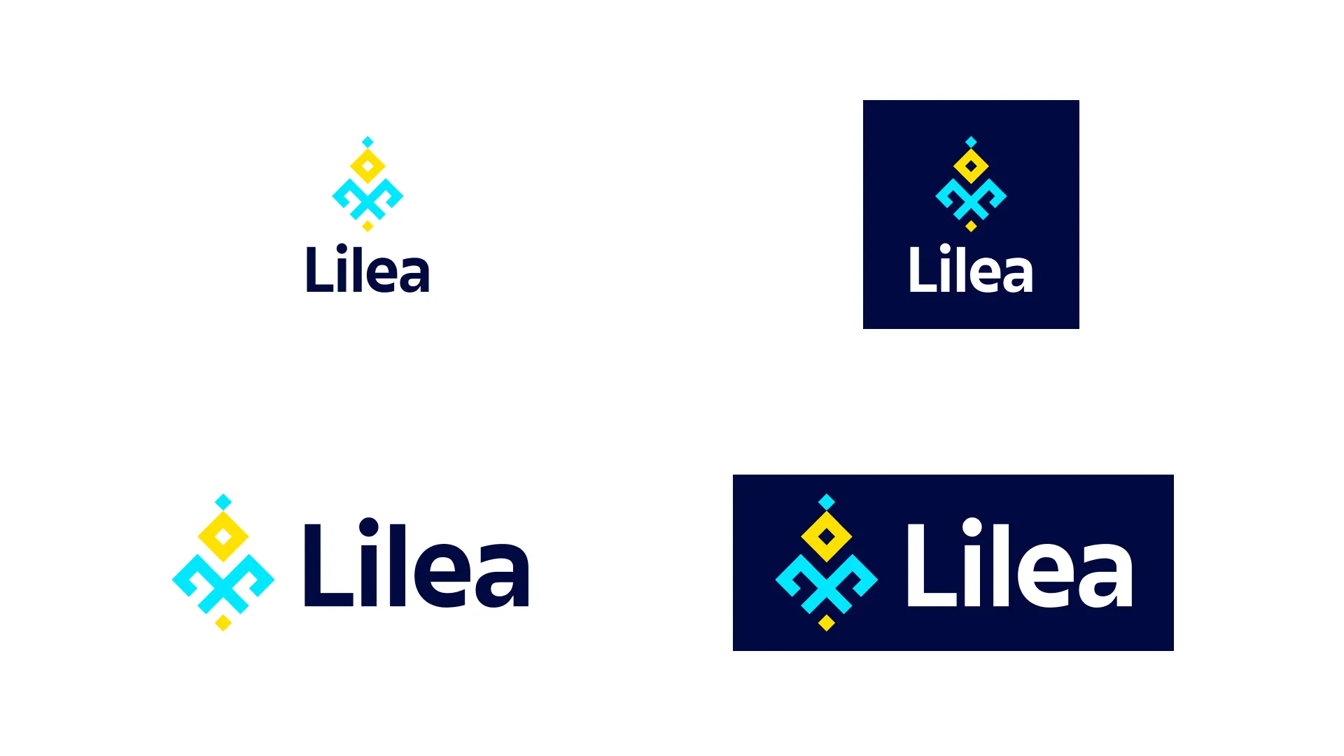
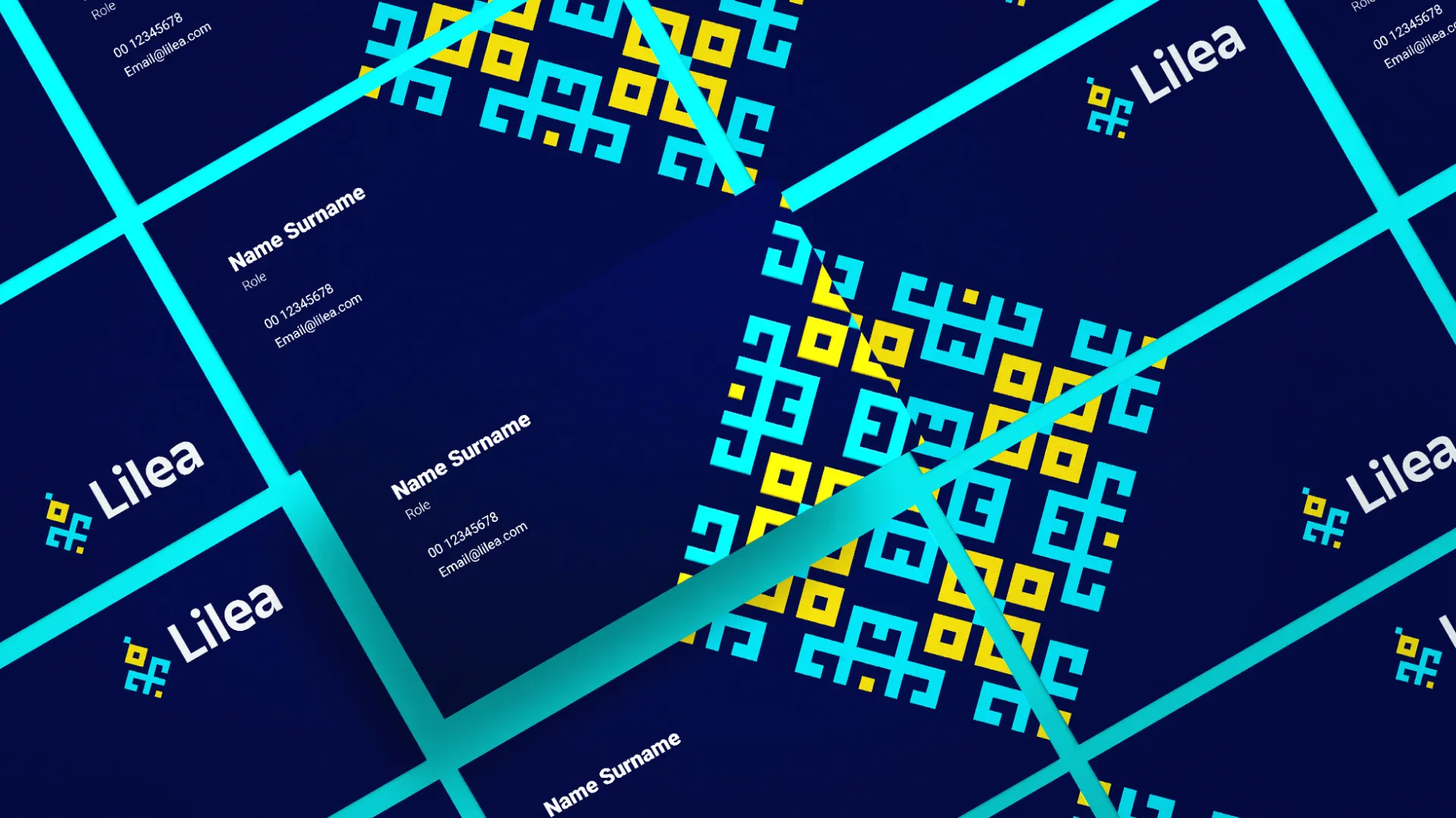
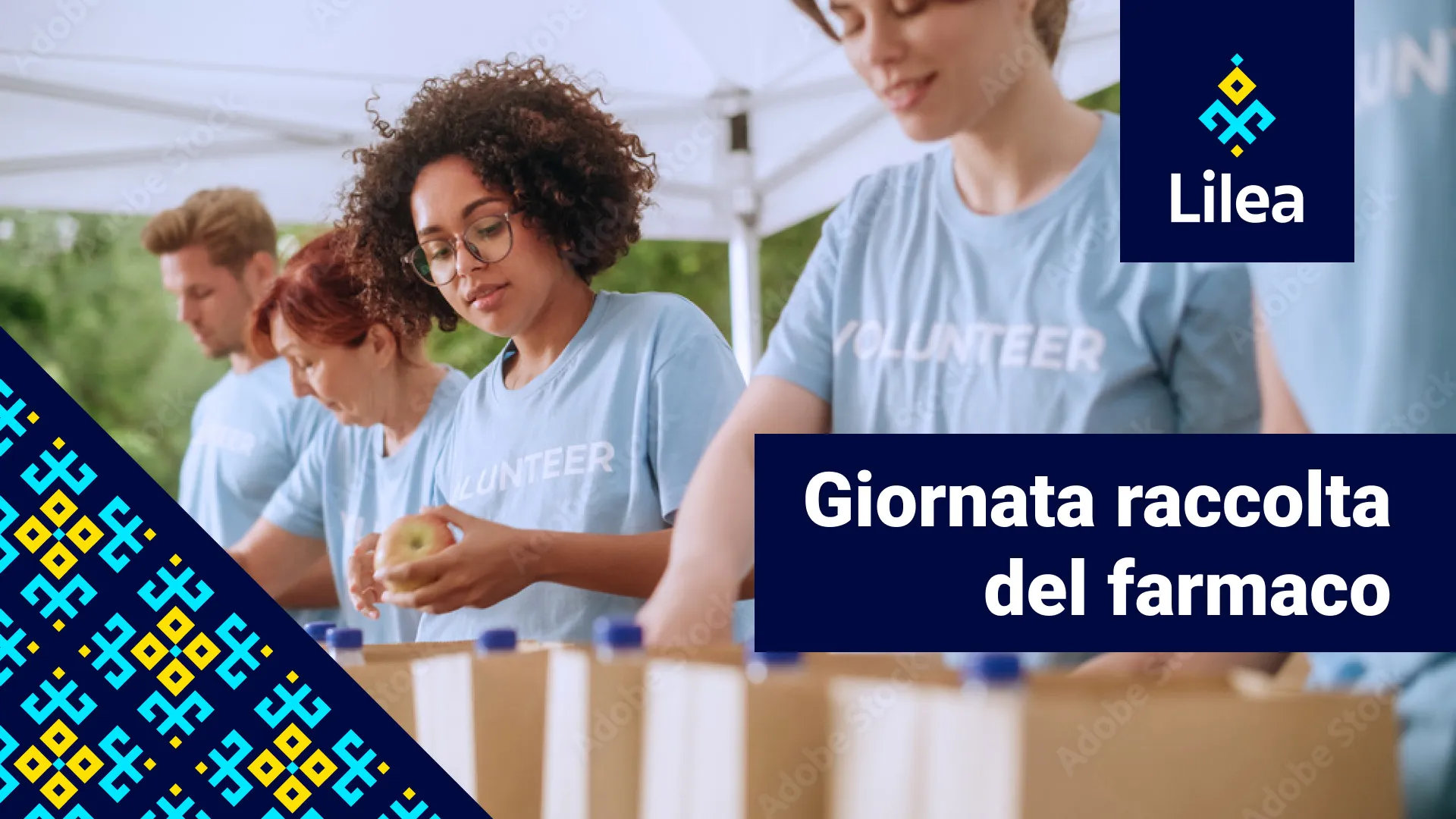
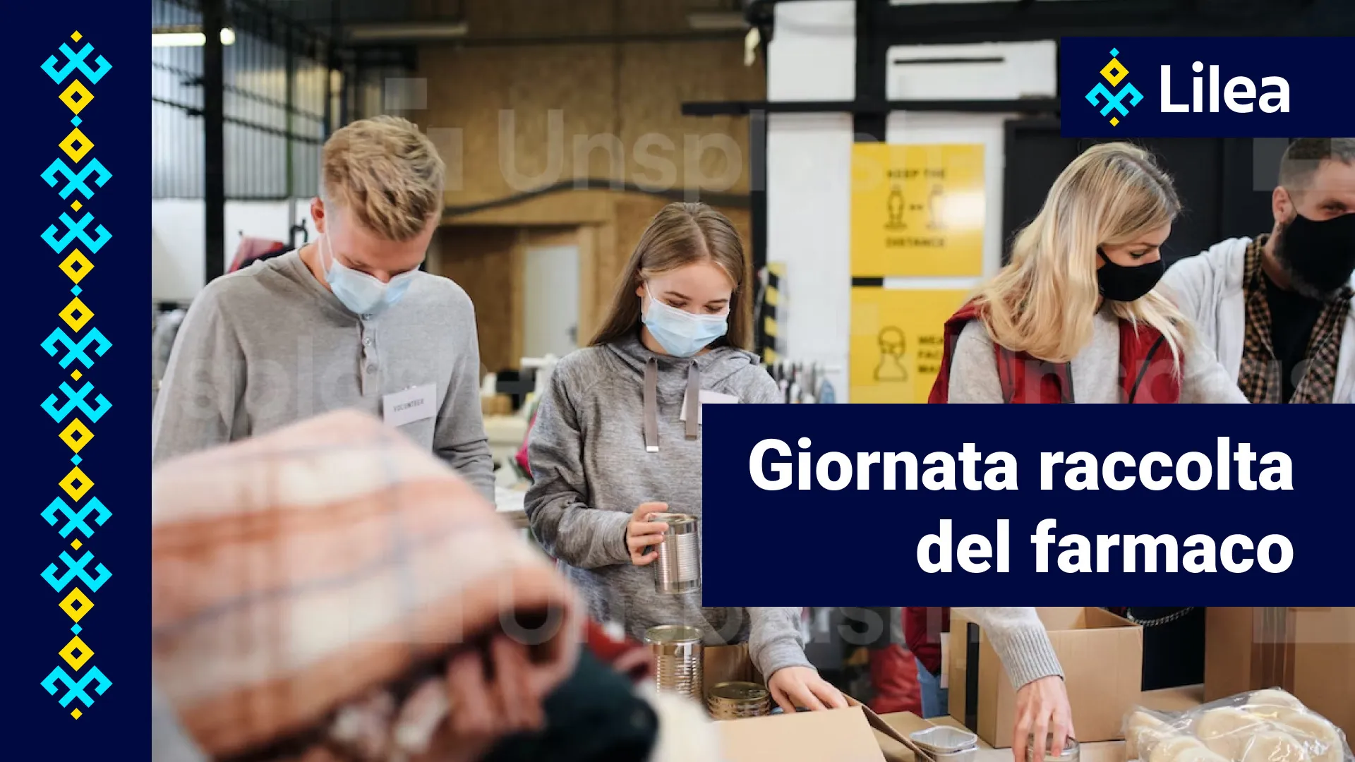
The resulting logo is a beautiful synthesis of Ukrainian and Florentine symbols. The core shape is reminiscent of a traditional Ukrainian textile pattern, skillfully morphed into the form of a "giglio." This unique blend not only represents the cultural heritage of both regions but also visually narrates the mission of LILEA - to develop bridges between Italy and Ukraine.
Outcome
The new brand identity was well-received by both the LILEA organization and the broader community. It successfully embodies the spirit of LILEA, fostering a sense of belonging and pride among Ukrainian immigrants in Tuscany while celebrating the unity and friendship between the two cultures.
This project not only allowed me to delve into the rich cultural tapestry of Ukraine and Italy but also demonstrated the power of design in bridging diverse communities. The LILEA brand identity stands as a testament to the harmonious fusion of two distinct cultural symbols into a unified and meaningful logo.