Branding Pix4D
Branding, 2020
- Role
- Tech Lead
- Company
- Pix4D SA
- Year
- 2020
Project overview
Pix4D is a leading photogrammetry software company, offering a suite of tools for mapping, modeling, and analysis across industries such as agriculture, construction, and surveying. As the brand matured, it needed a more modern, flexible, and digitally-optimized identity that could scale across platforms and unify its growing family of products.
My role was to lead the rebranding of both the corporate identity and the product identity system, creating a cohesive visual language that reflects the company’s innovation while addressing the limitations of the previous branding.
Challenge
The previous logo, built around a tilted Möbius loop, lacked clarity and versatility. It was:
- Difficult to adapt across platforms and screen sizes
- Inefficient in digital environments due to its color palette
- Visually disconnected from the company’s technological core
The goal was to modernize the brand, preserve a sense of continuity, and build a scalable identity system for Pix4D’s expanding product suite.
Approach
Corporate Identity
Logo Redesign
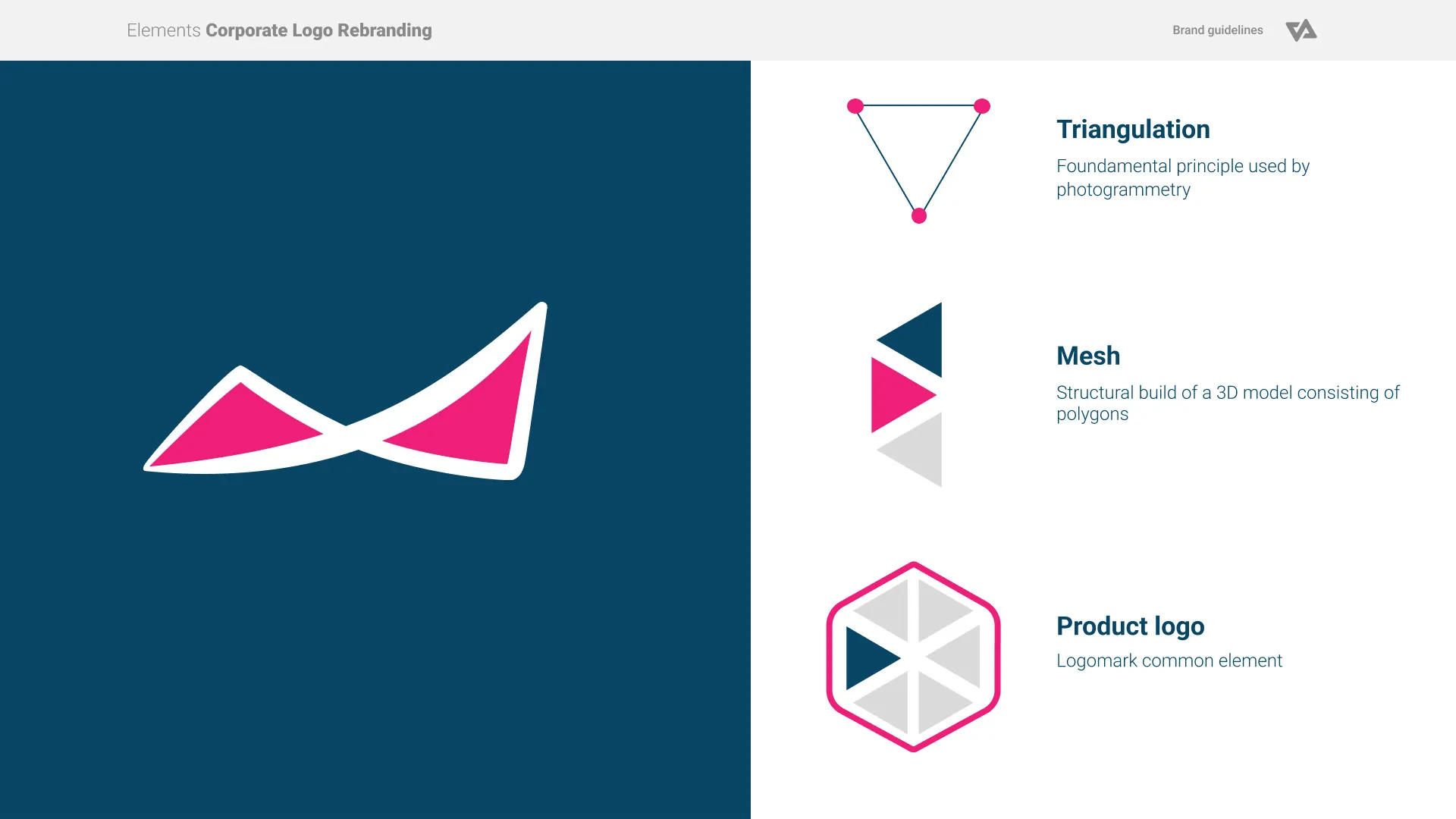
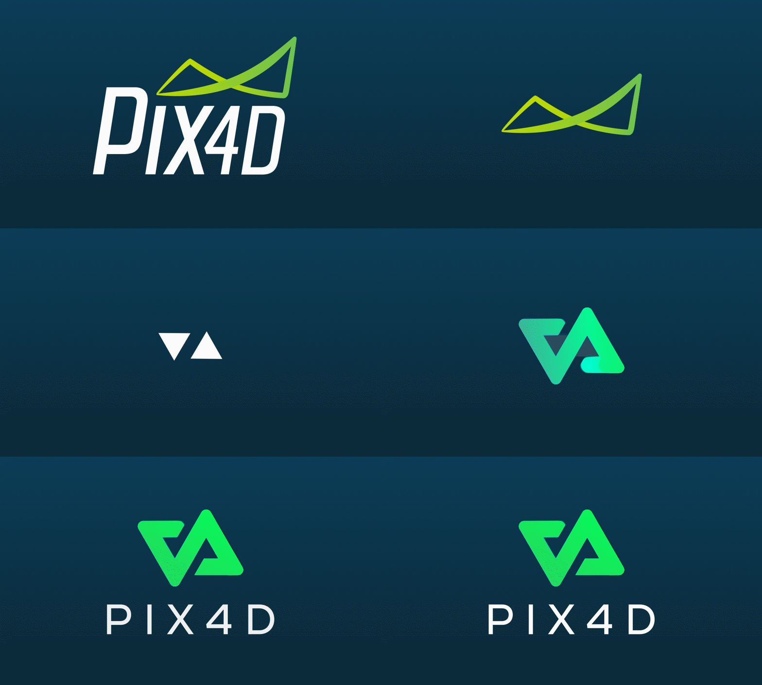
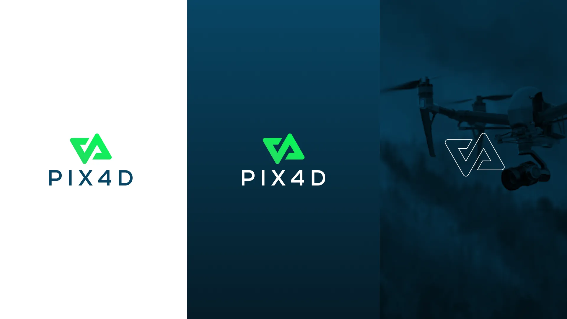
I started by analyzing the legacy Möbius loop. When viewed negatively, the shape revealed two interlocking triangles, a subtle nod to triangulation and mesh structures, fundamental concepts in photogrammetry.
Symbol Evolution
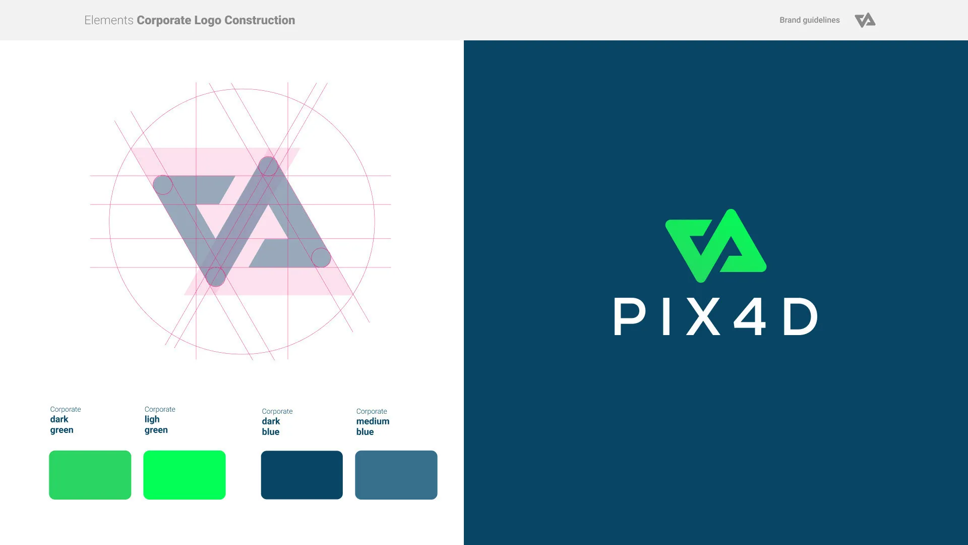
I built a new geometric form around these two triangles, maintaining a visual connection to the original identity while introducing a sharper, modern aesthetic that reflects evolution and continuity.
Color Optimization
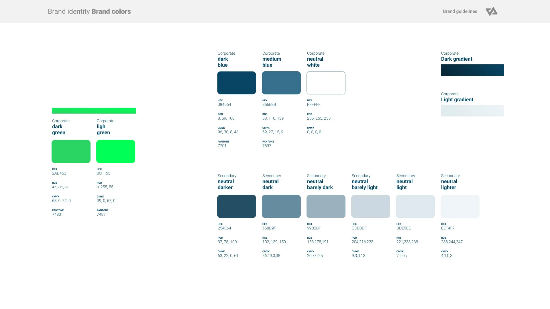
I retained the brand’s green accent for recognition, while shifting the primary neutral palette to a deep digital blue , conveying technology, trust, and professionalism. All colors were optimized for digital legibility and contrast.
Responsive Design:
The new identity is fully responsive, with scalable logo versions that ensure clarity and recognition across devices, applications, and environments.

Product Family Identity
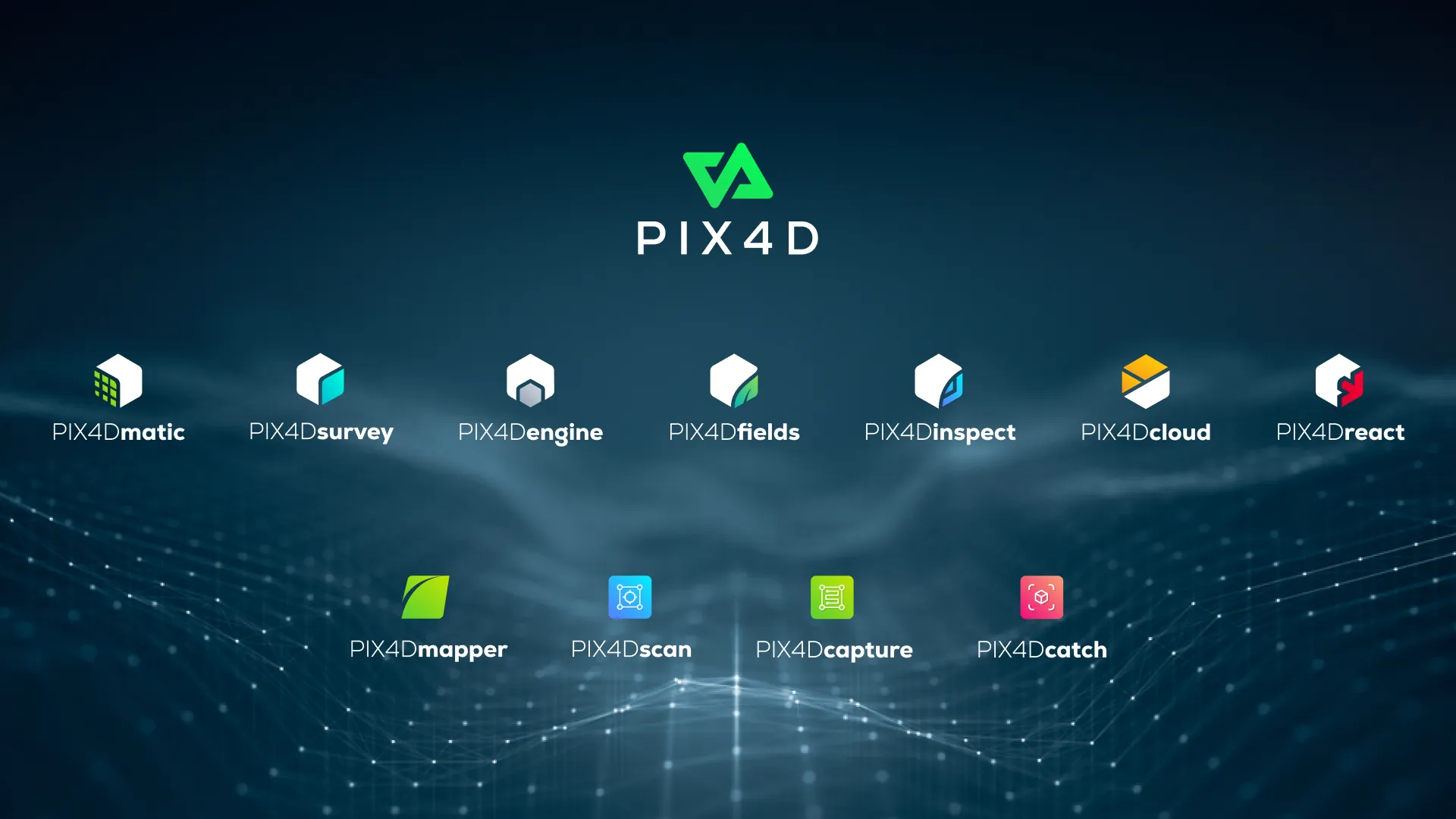
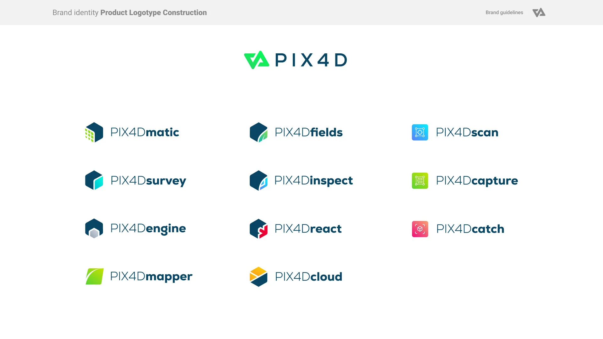
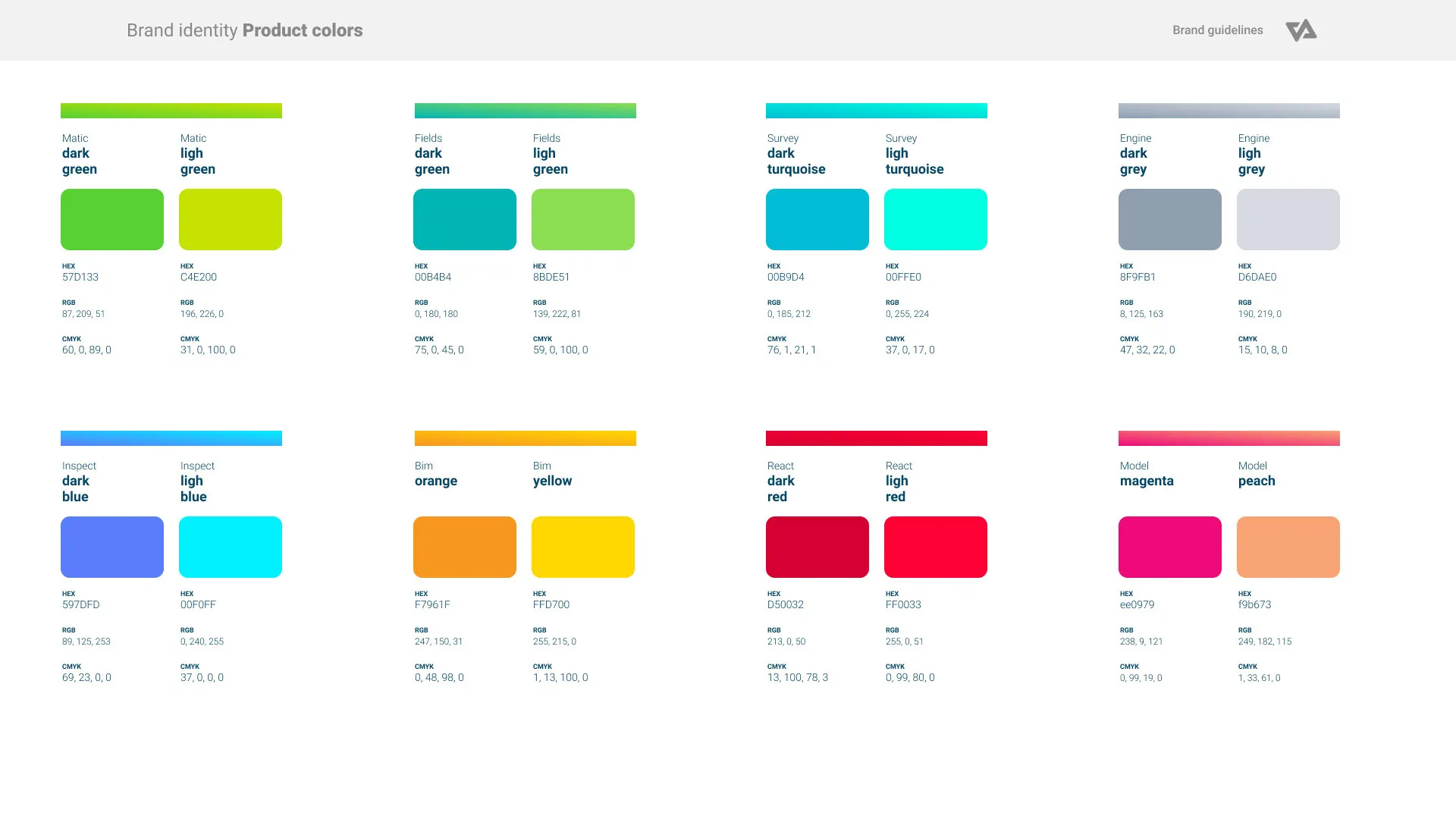
To unify Pix4D’s growing software suite, I created a modular product identity system based on shared design principles:
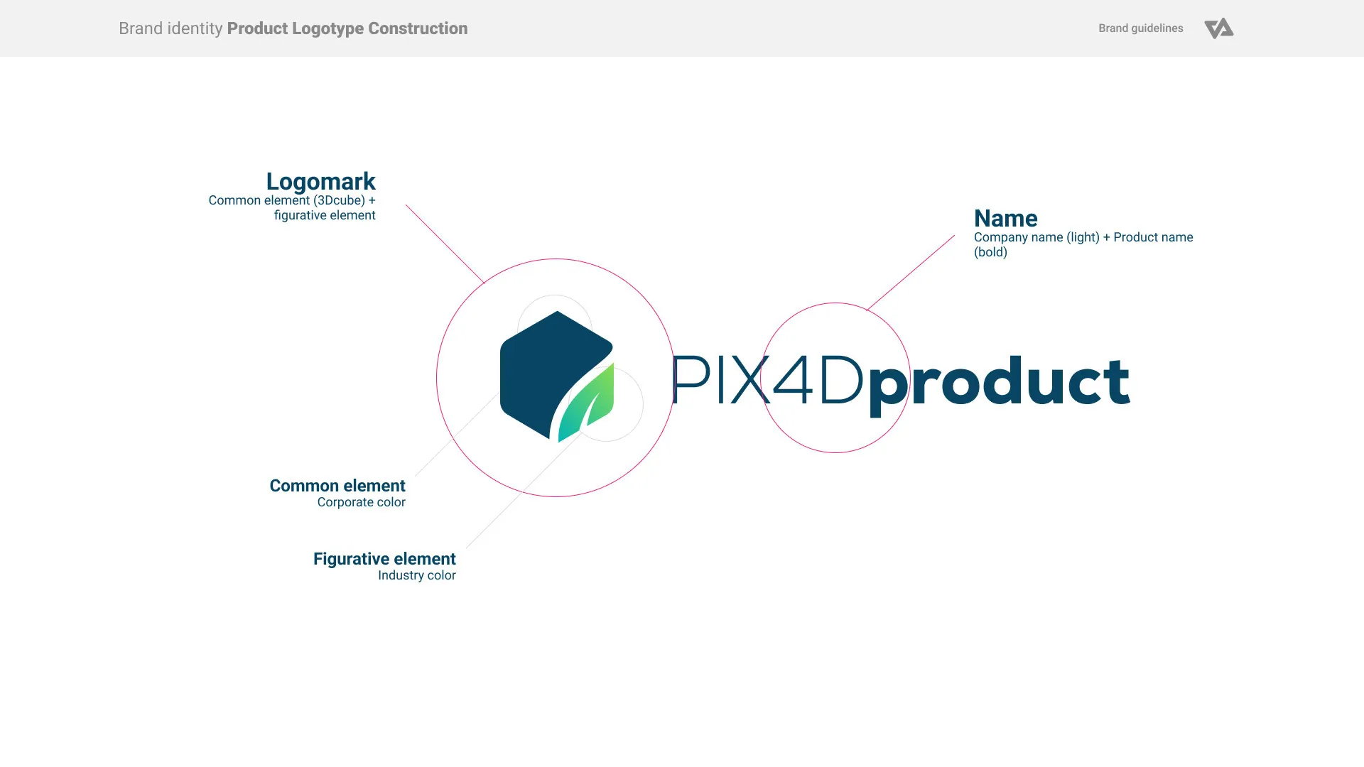
- Logomark System: Each product logo consists of:
- A common element – a hexagon, chosen for its isometric resemblance to a cube and its composition of triangles, echoing the corporate logo’s geometry.
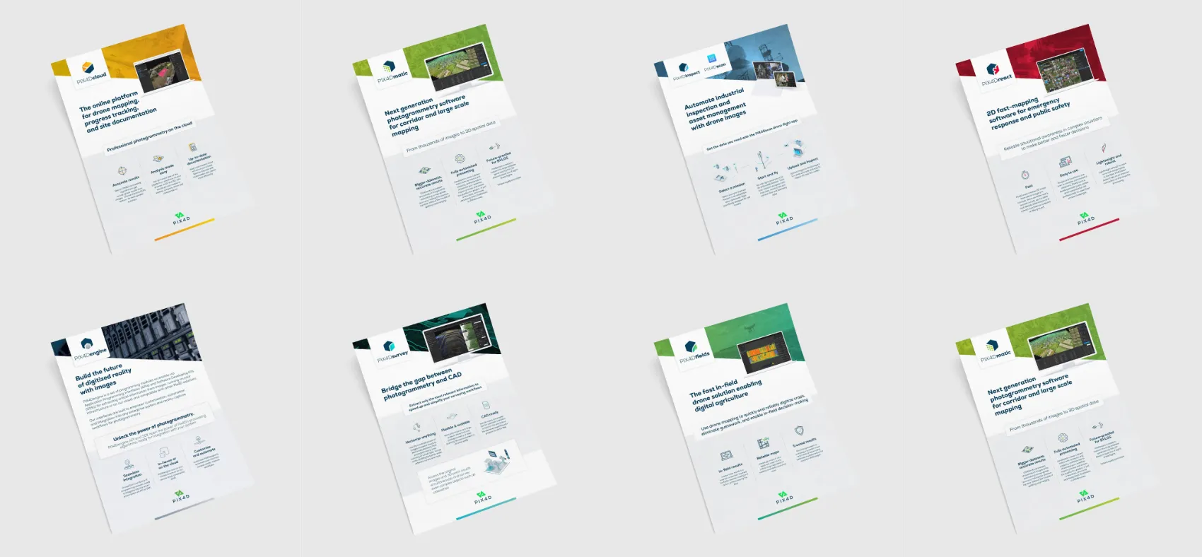
- A figurative element – unique to each product, visually representing its domain. For example, PIX4Dfields features a leaf, referencing its agricultural use.
- Naming Convention: Typography follows a consistent hierarchy: the corporate name in bold, paired with the product identifier in light.
This system ensures consistency, scalability, and ease of expansion for future product lines.
Outcome
The new Pix4D identity system:
Modernizes the brand while honoring its heritage
Strengthens digital presence through responsive, high-contrast design
Unifies the product ecosystem through a coherent visual and naming system
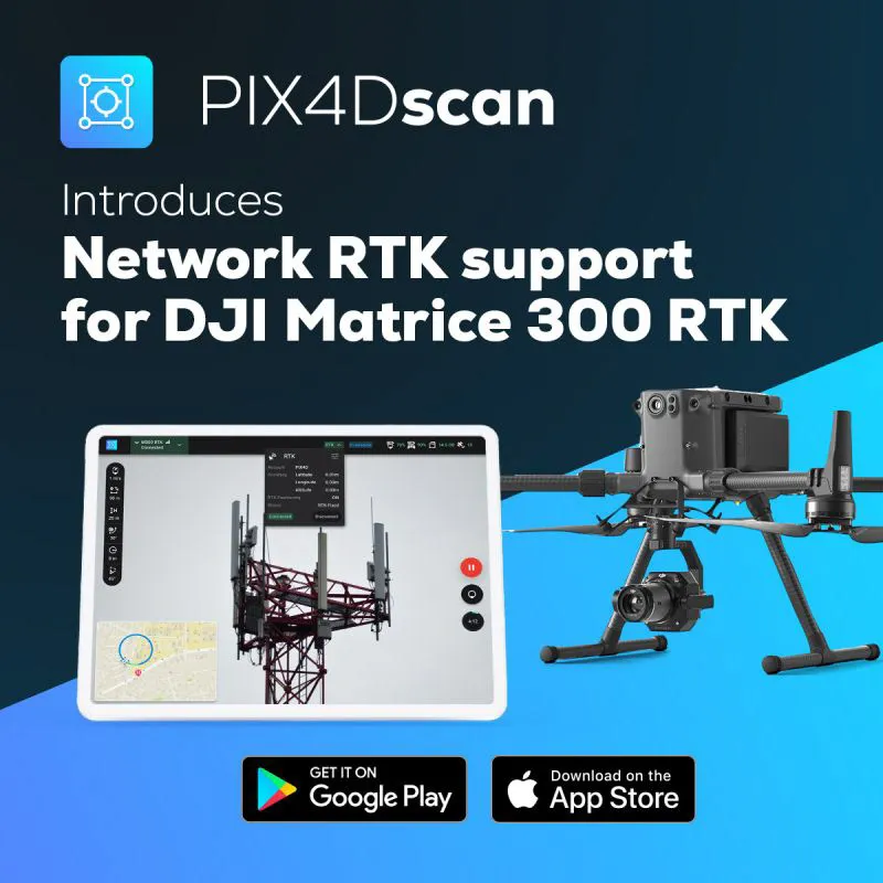
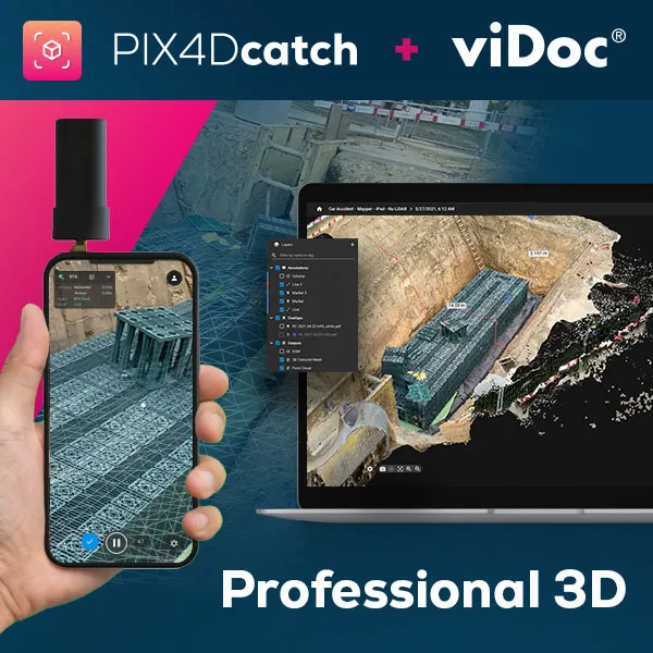
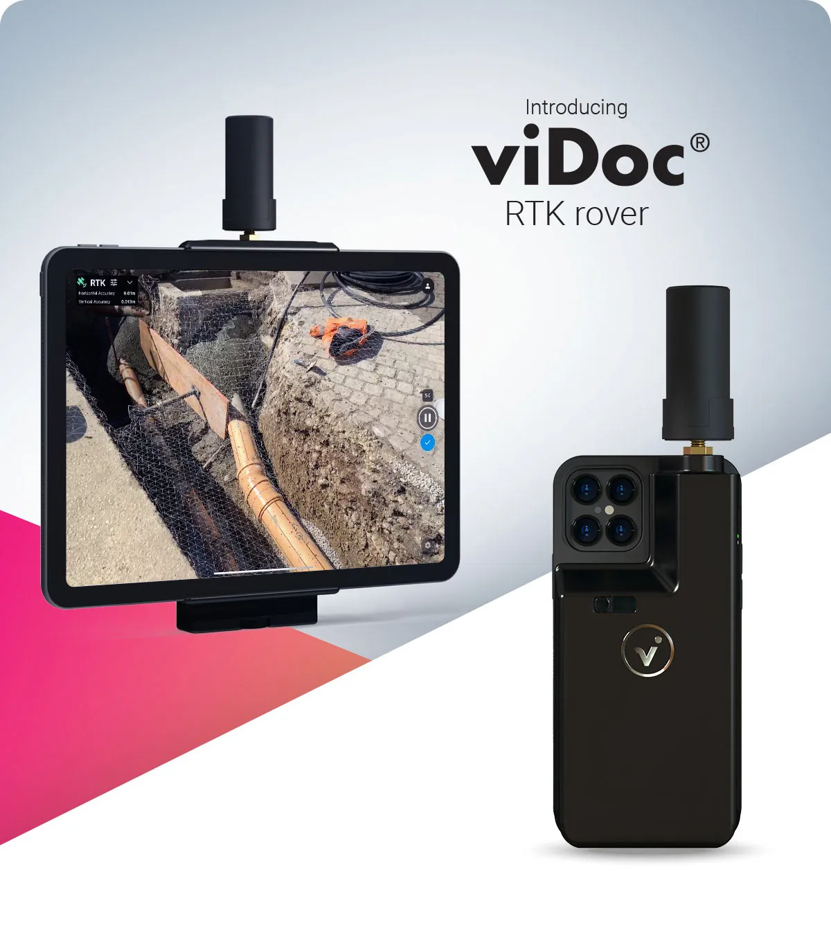
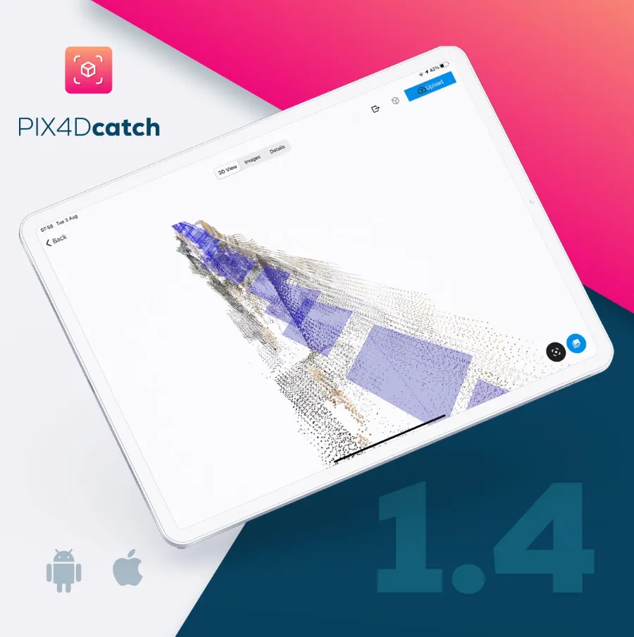
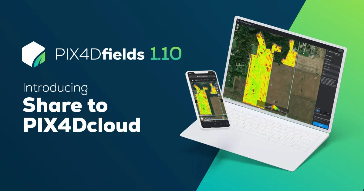
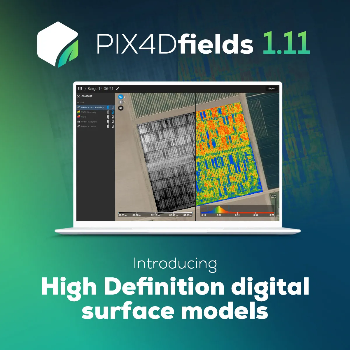
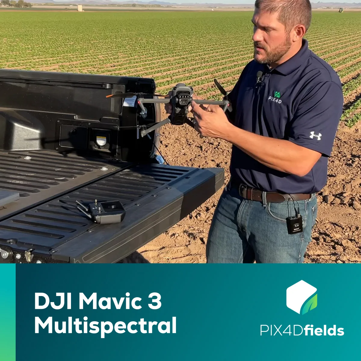
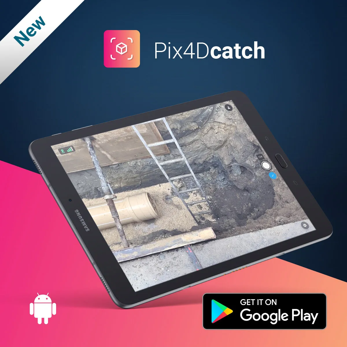
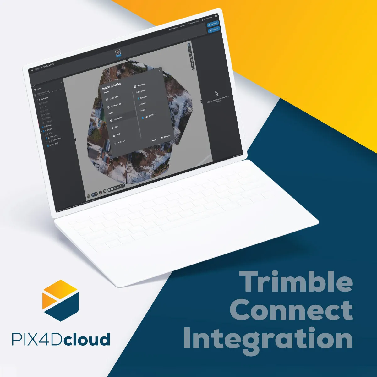
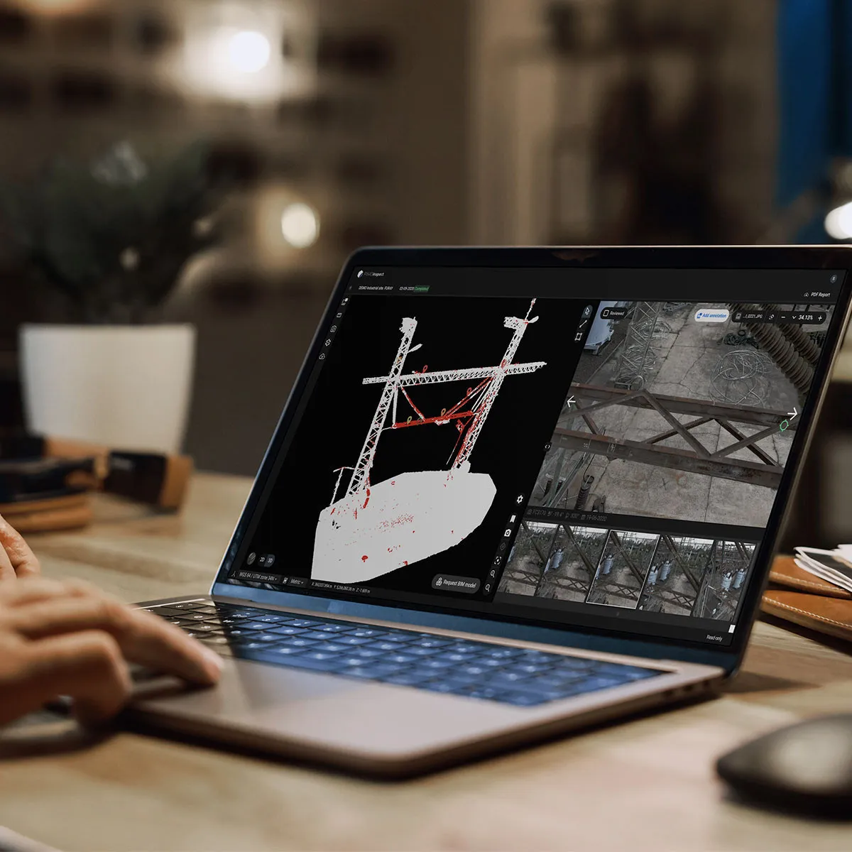
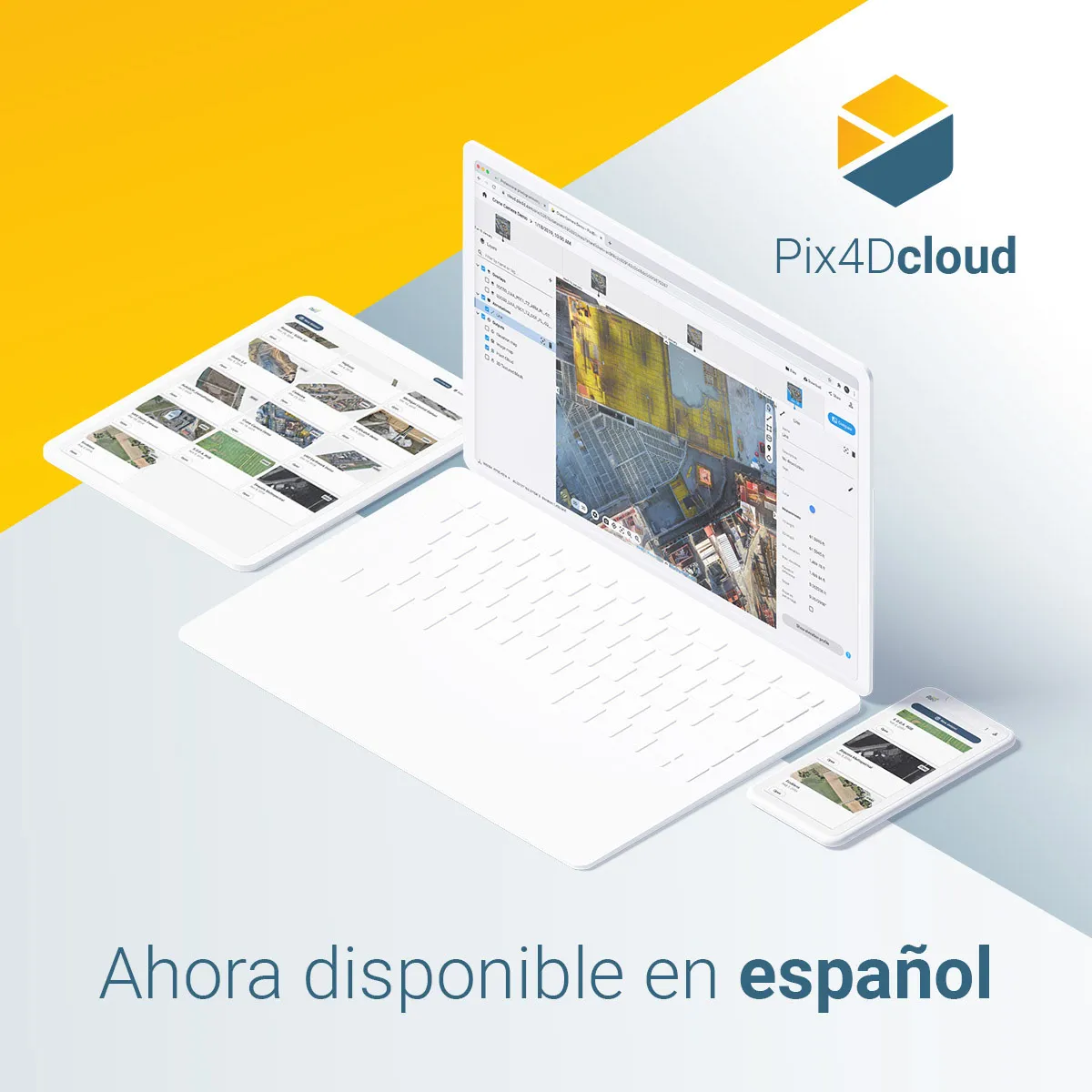
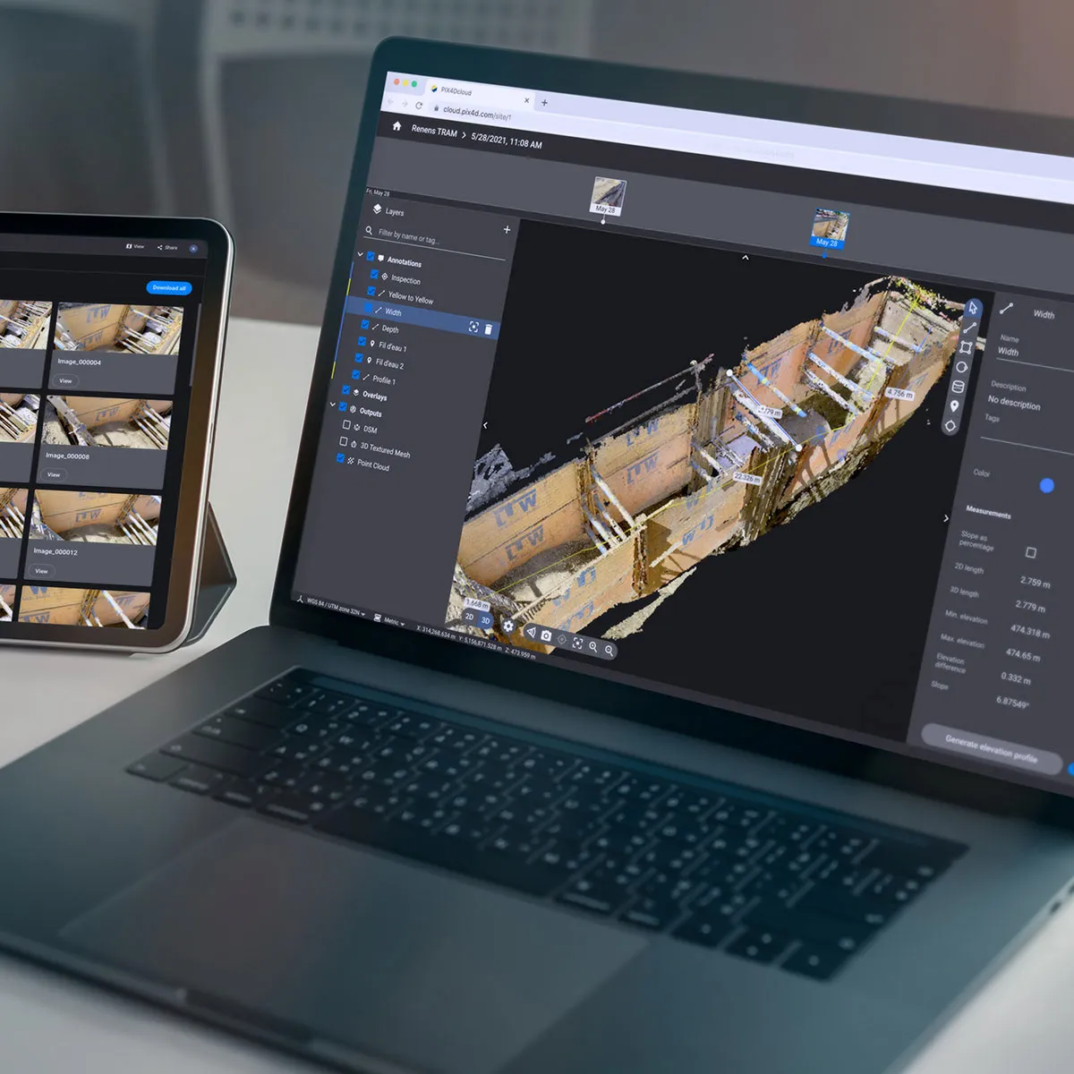
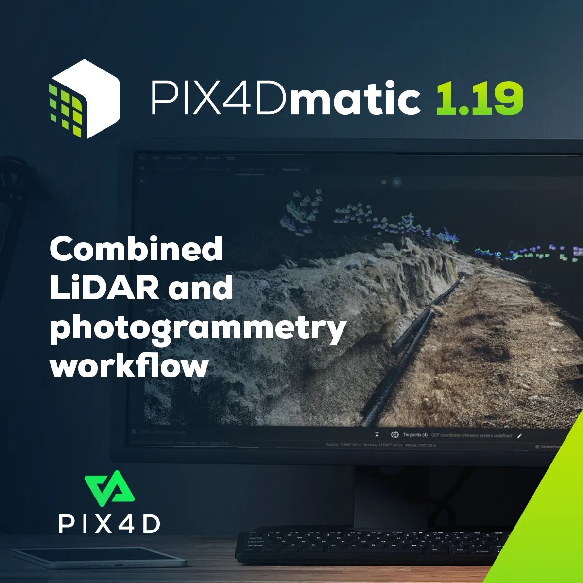
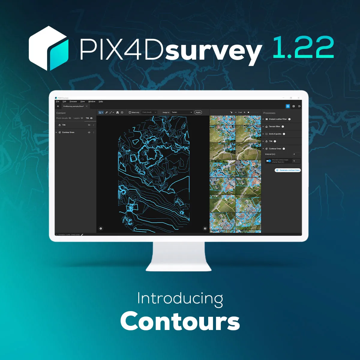
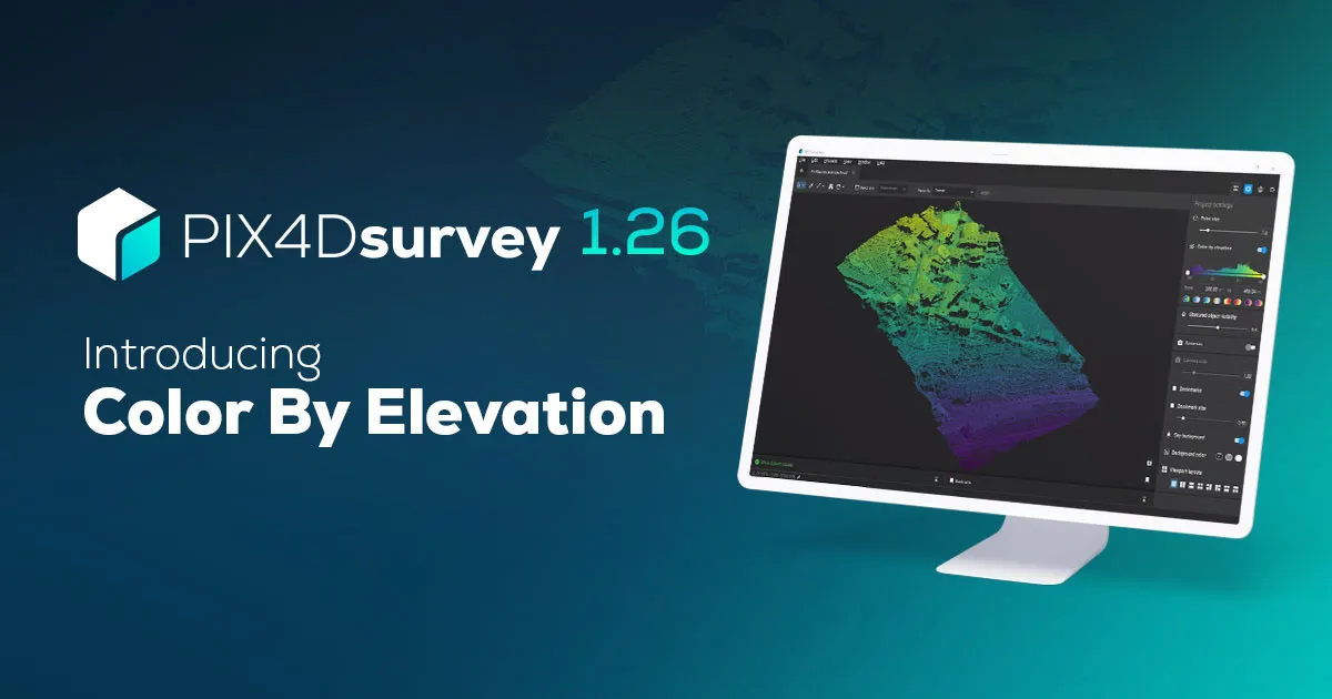
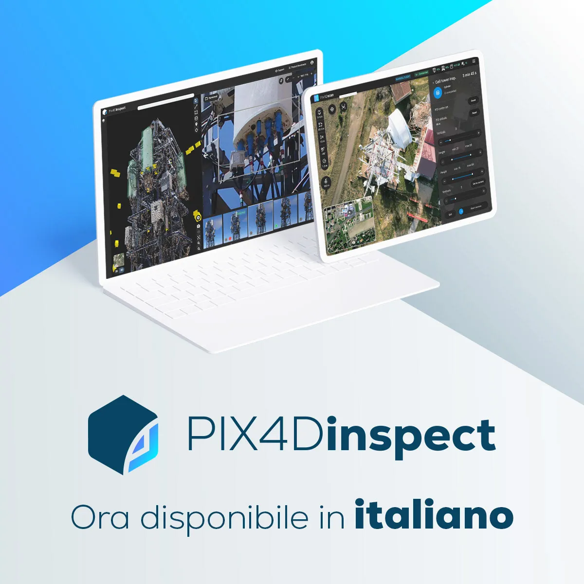
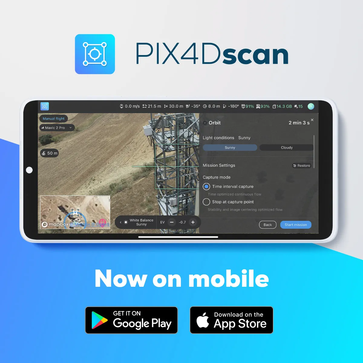
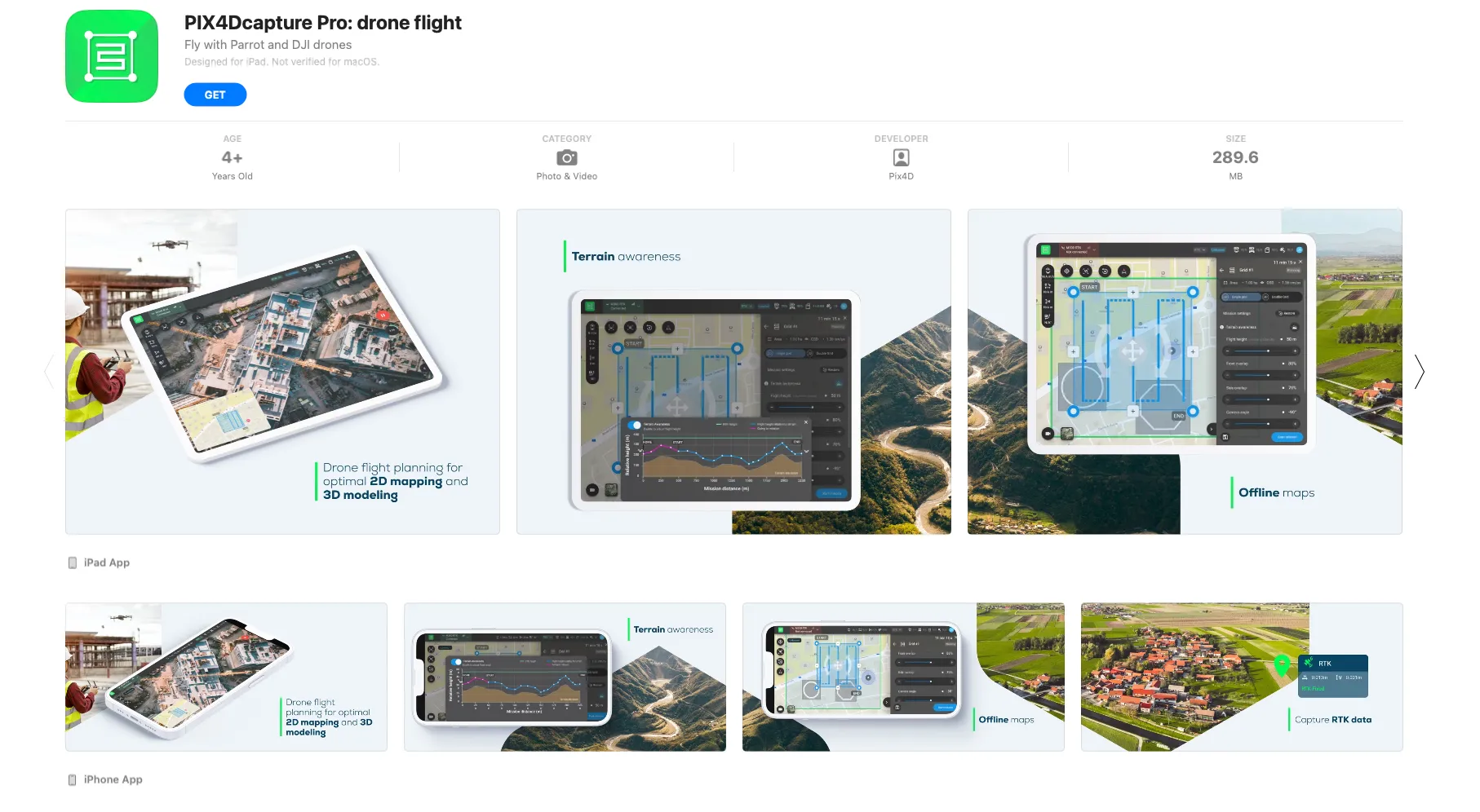
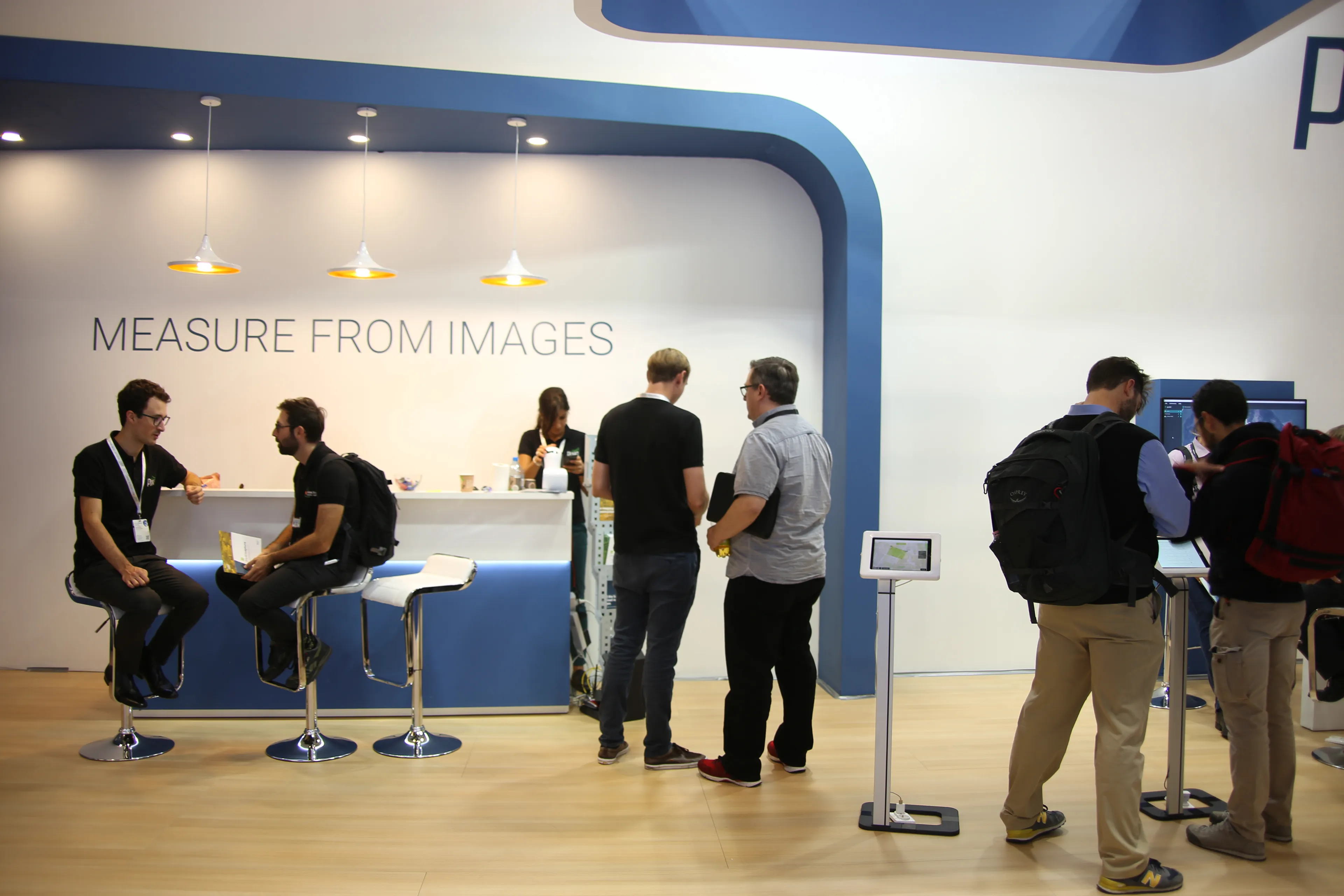
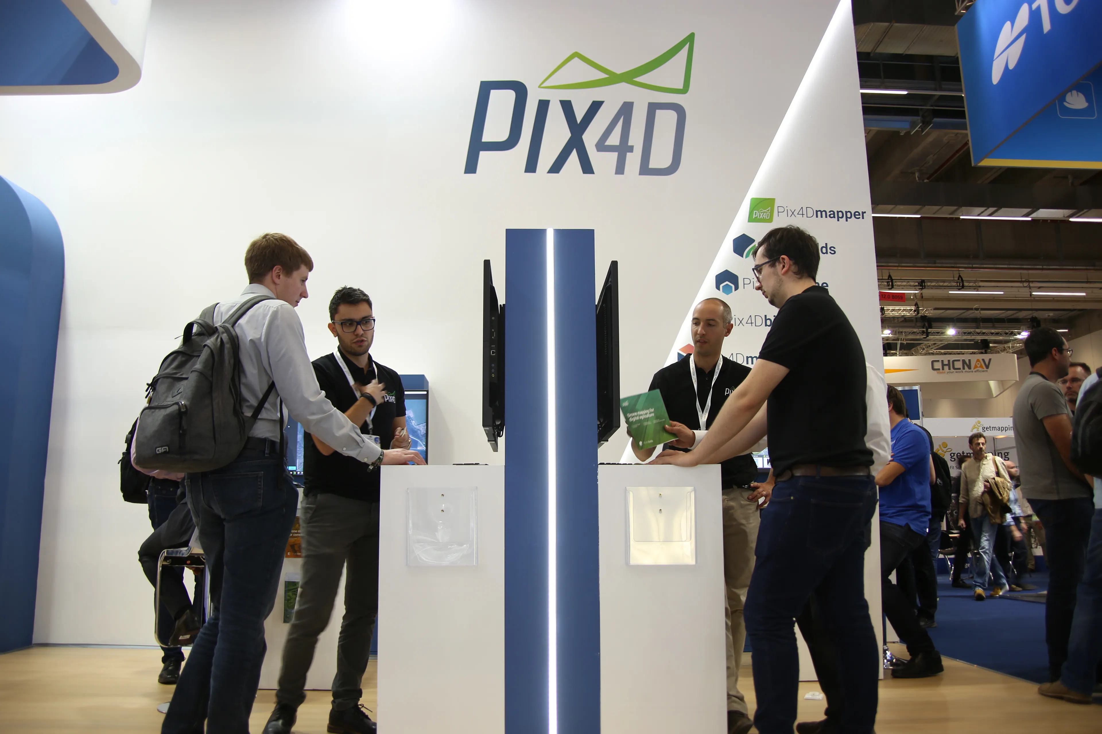
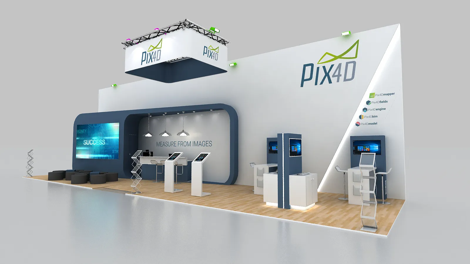
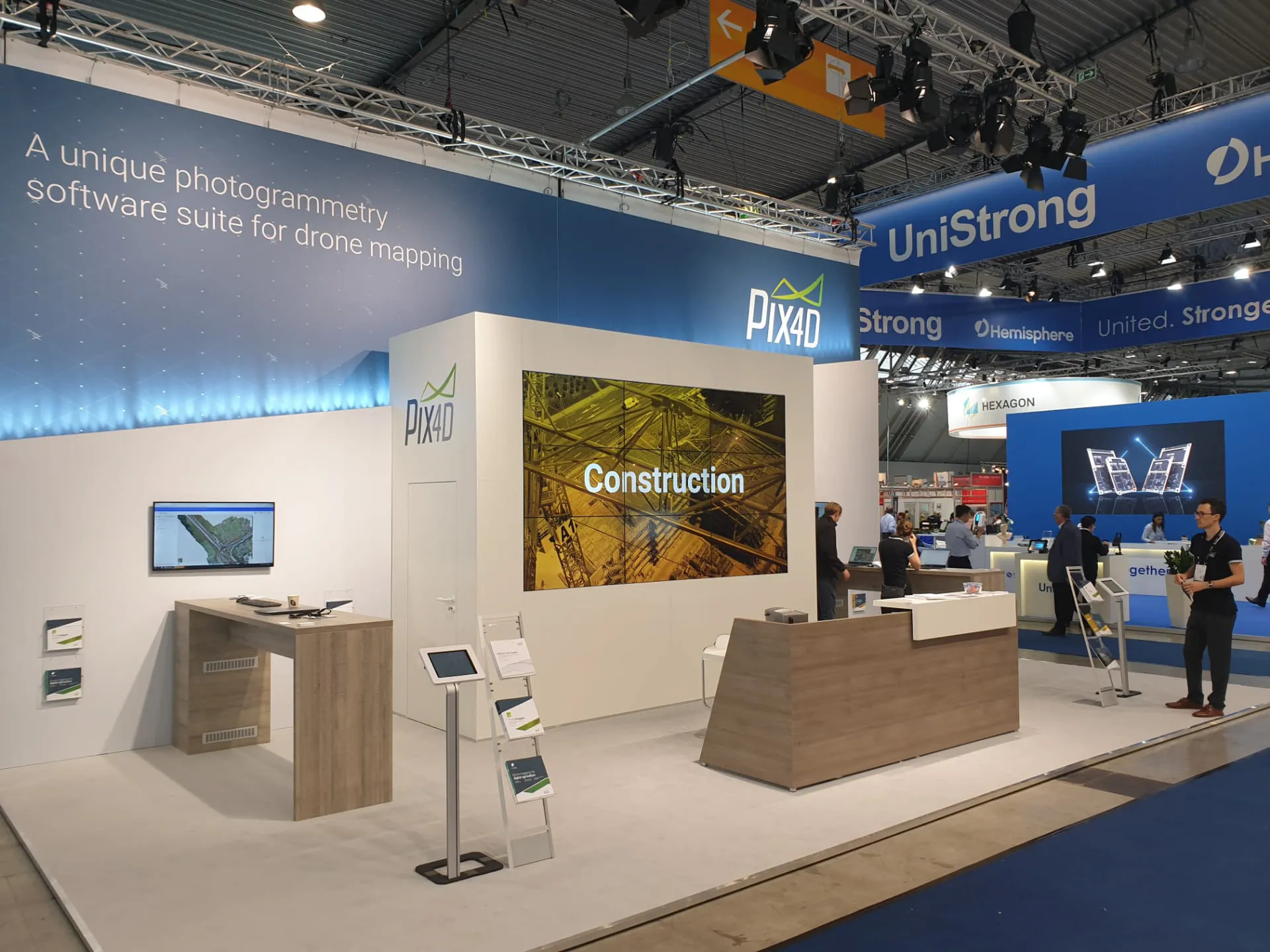
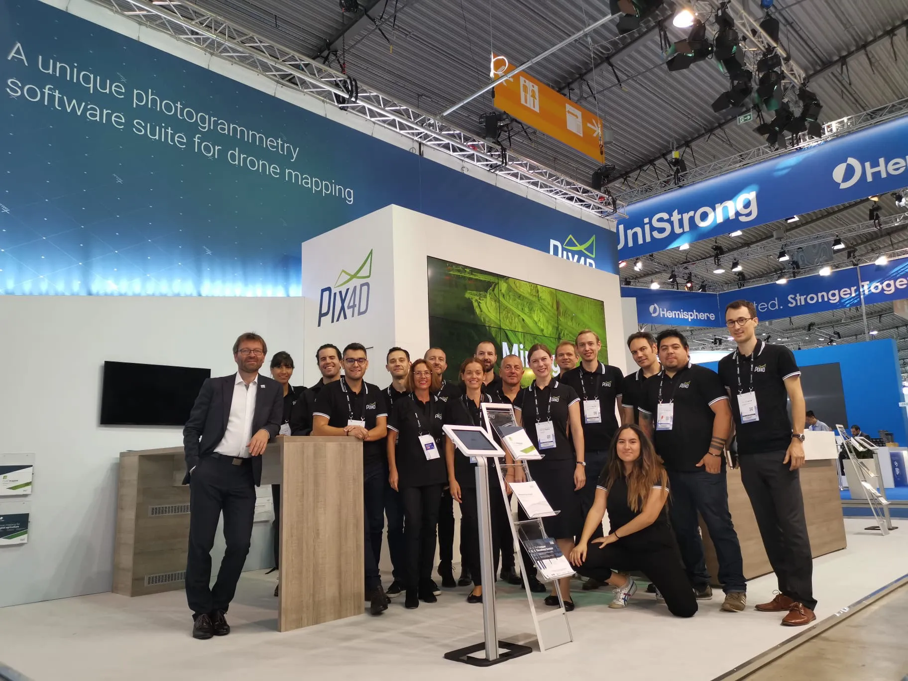
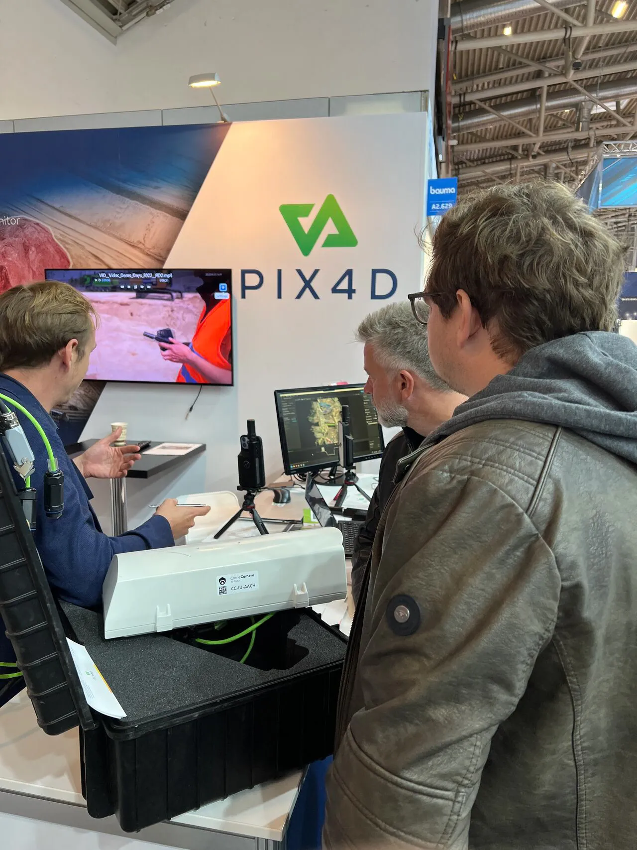
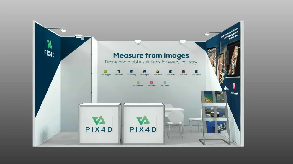
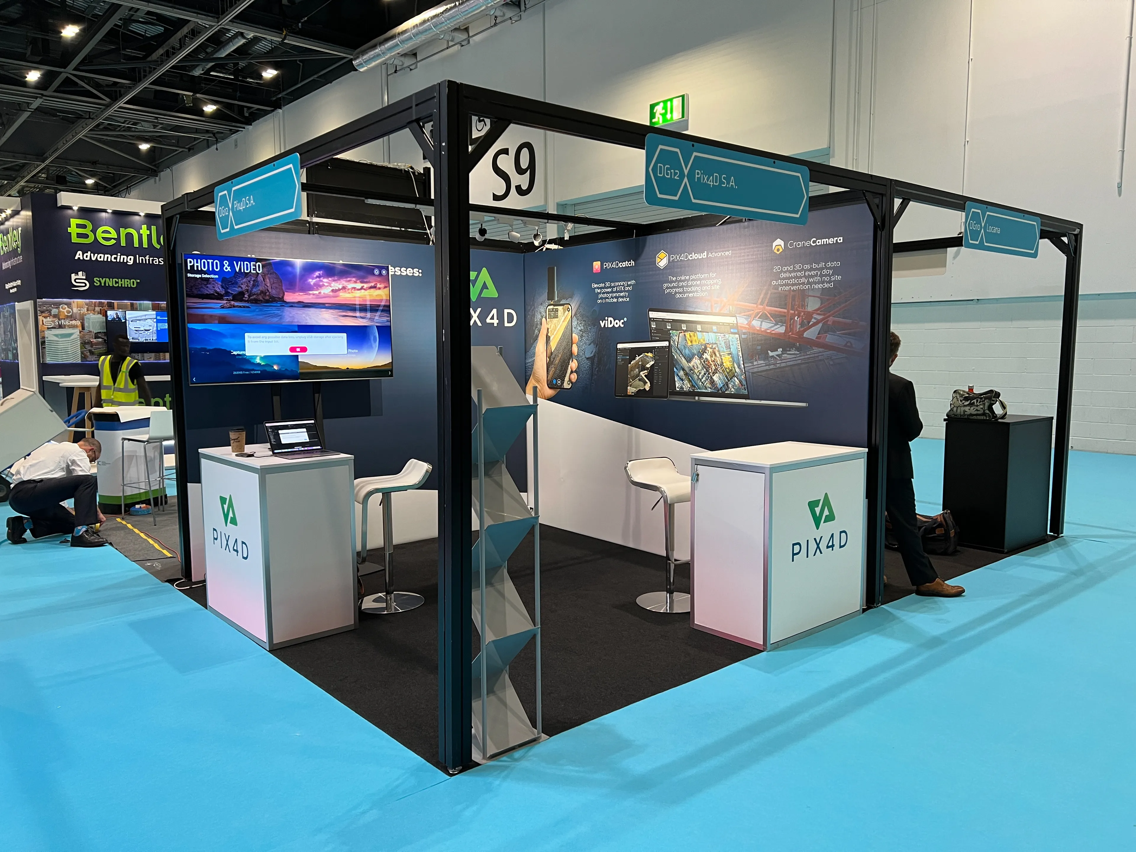
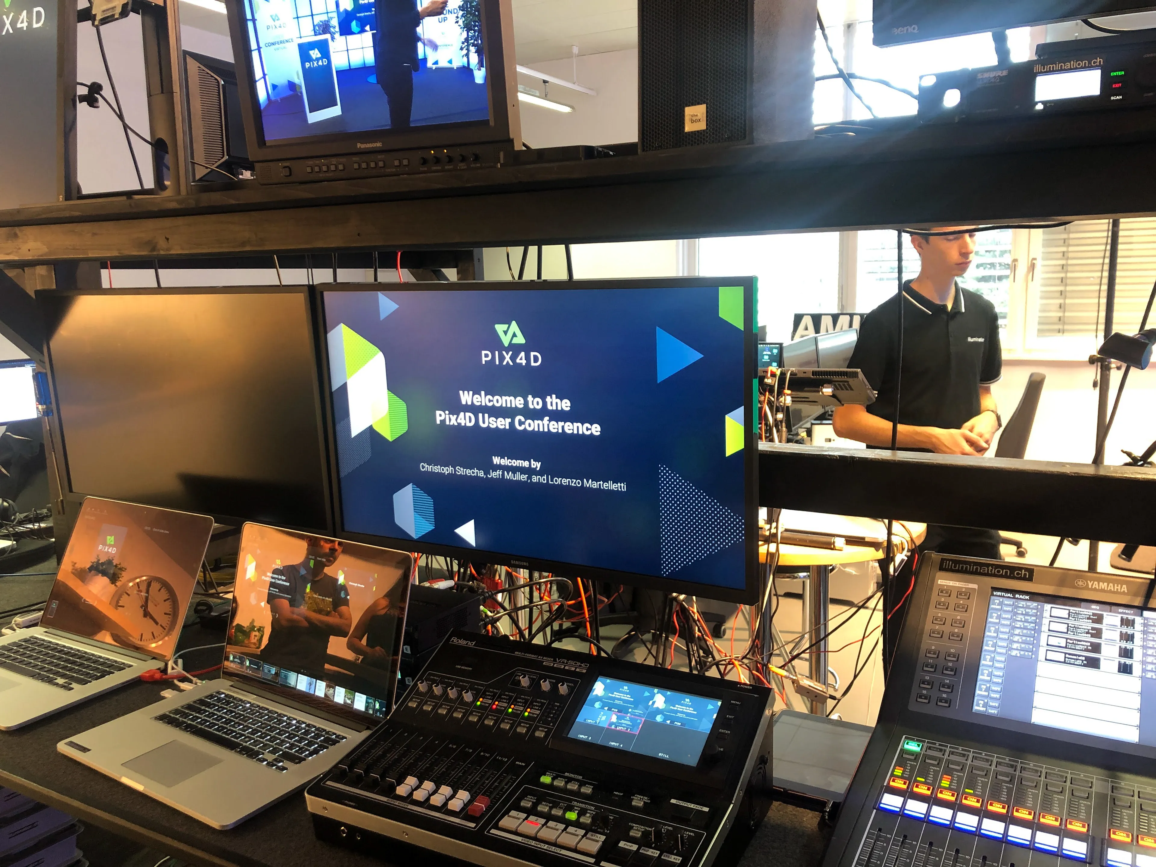
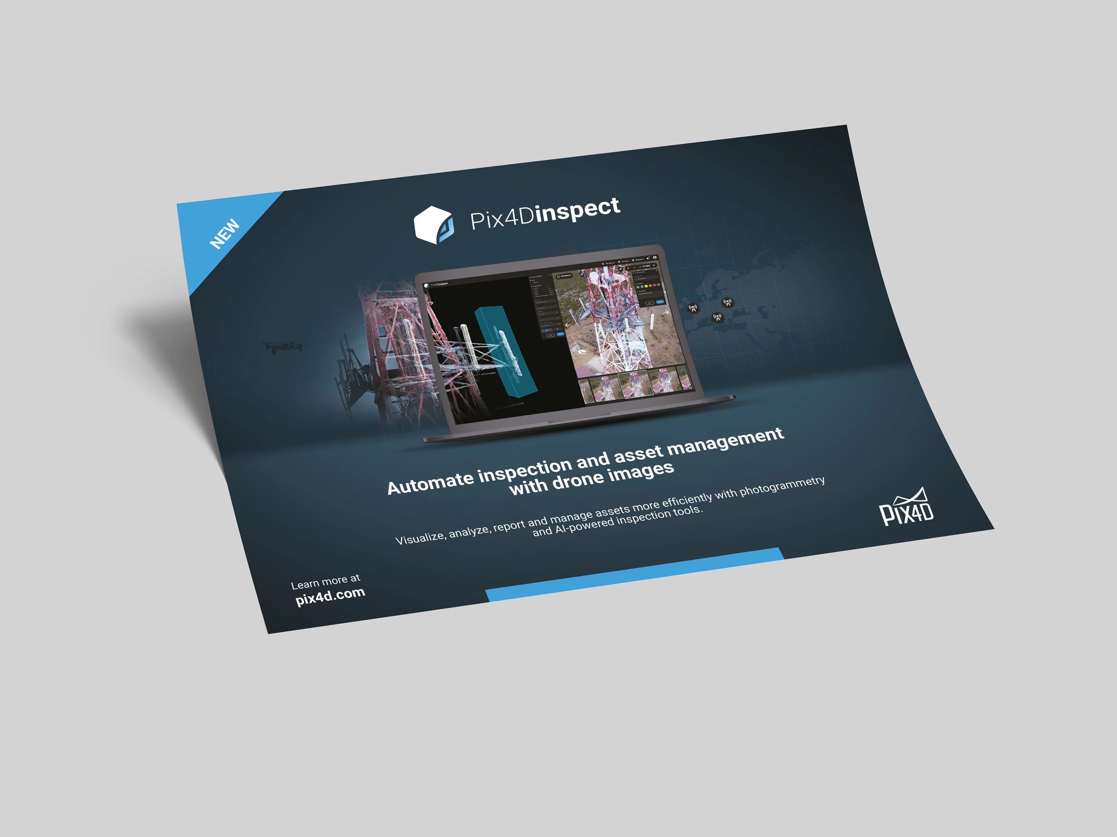
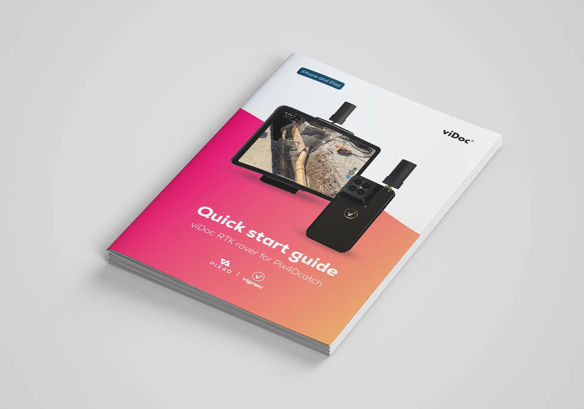
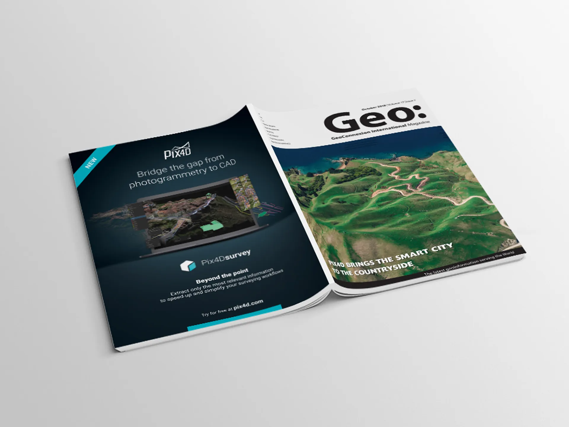
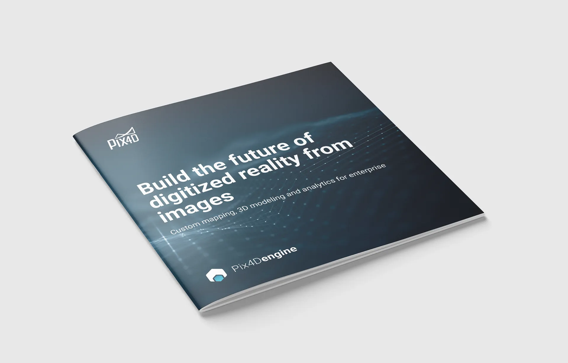
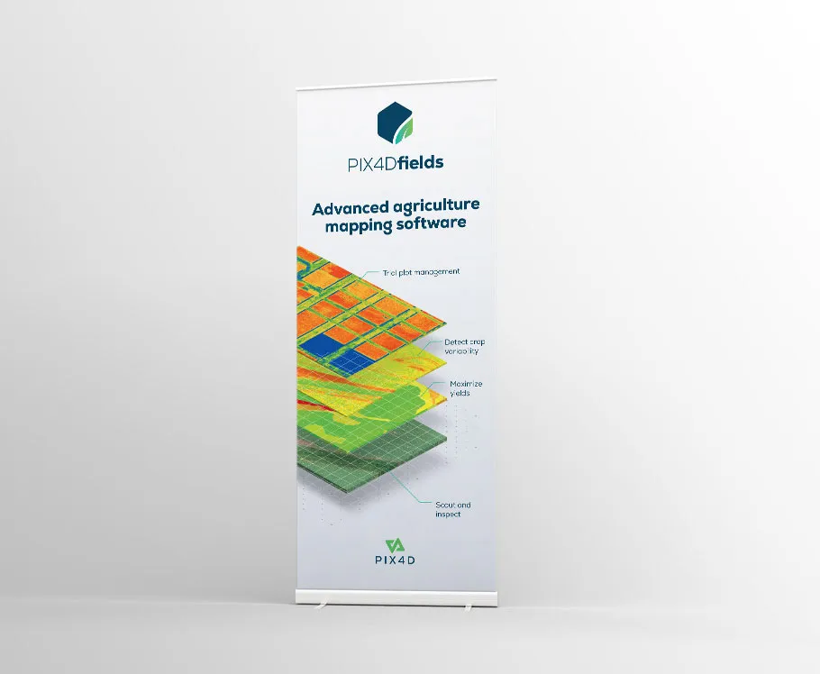
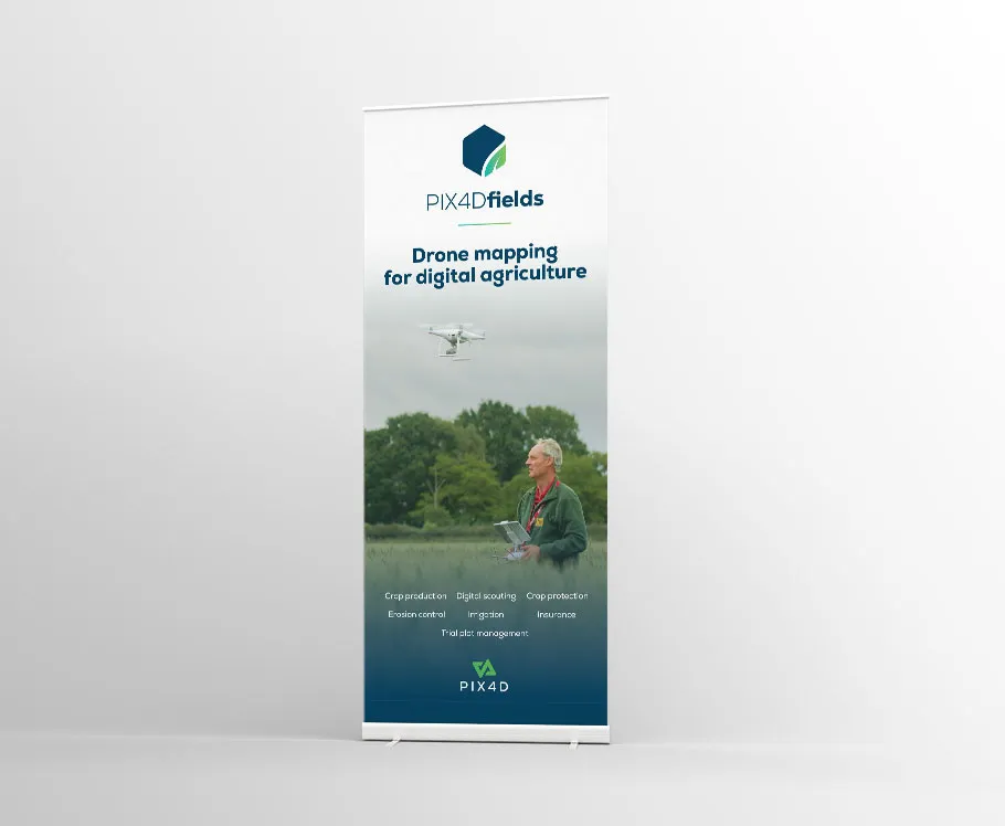
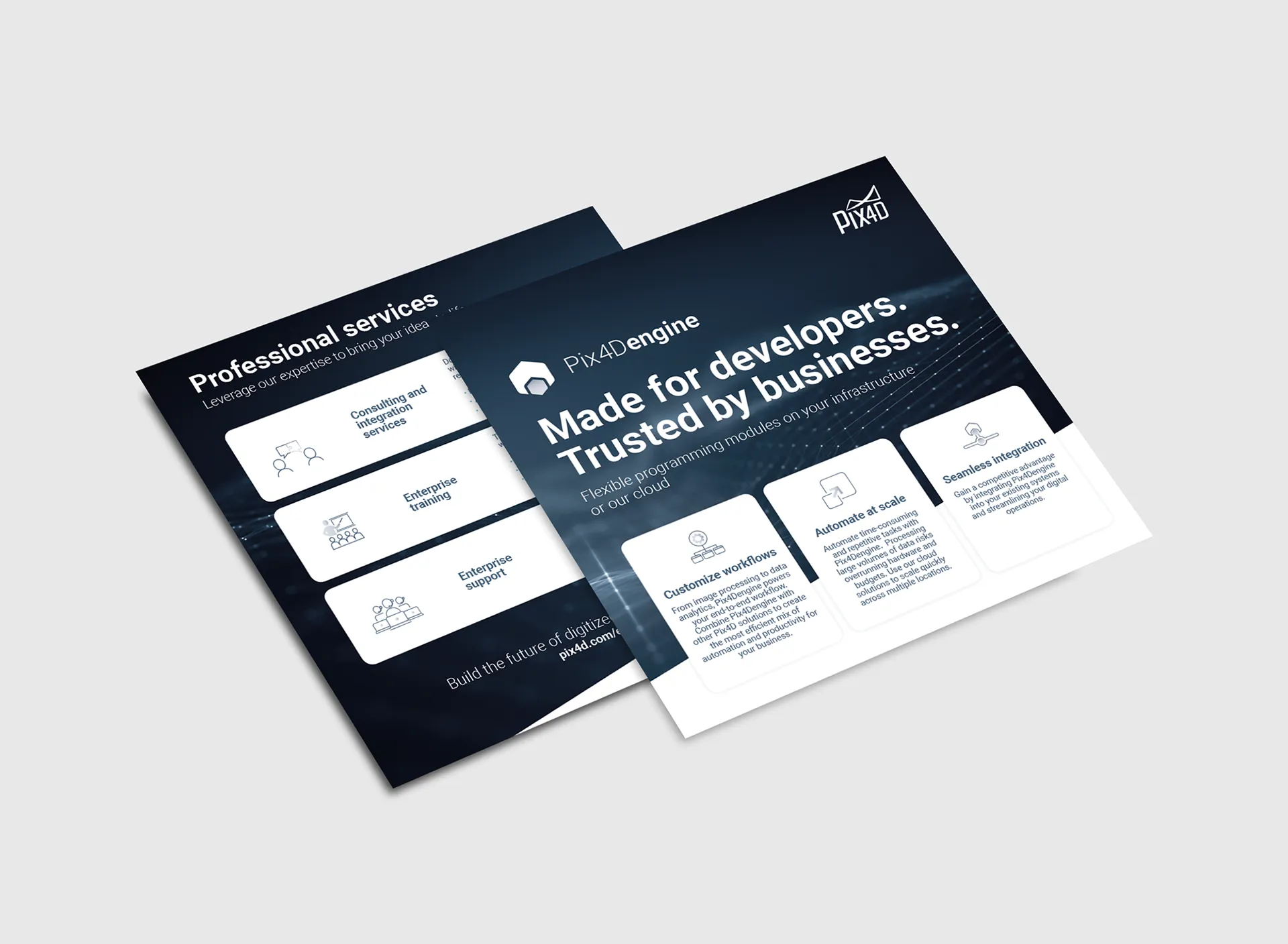
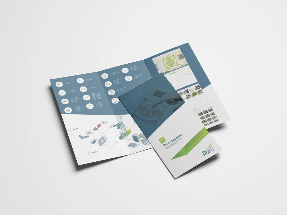
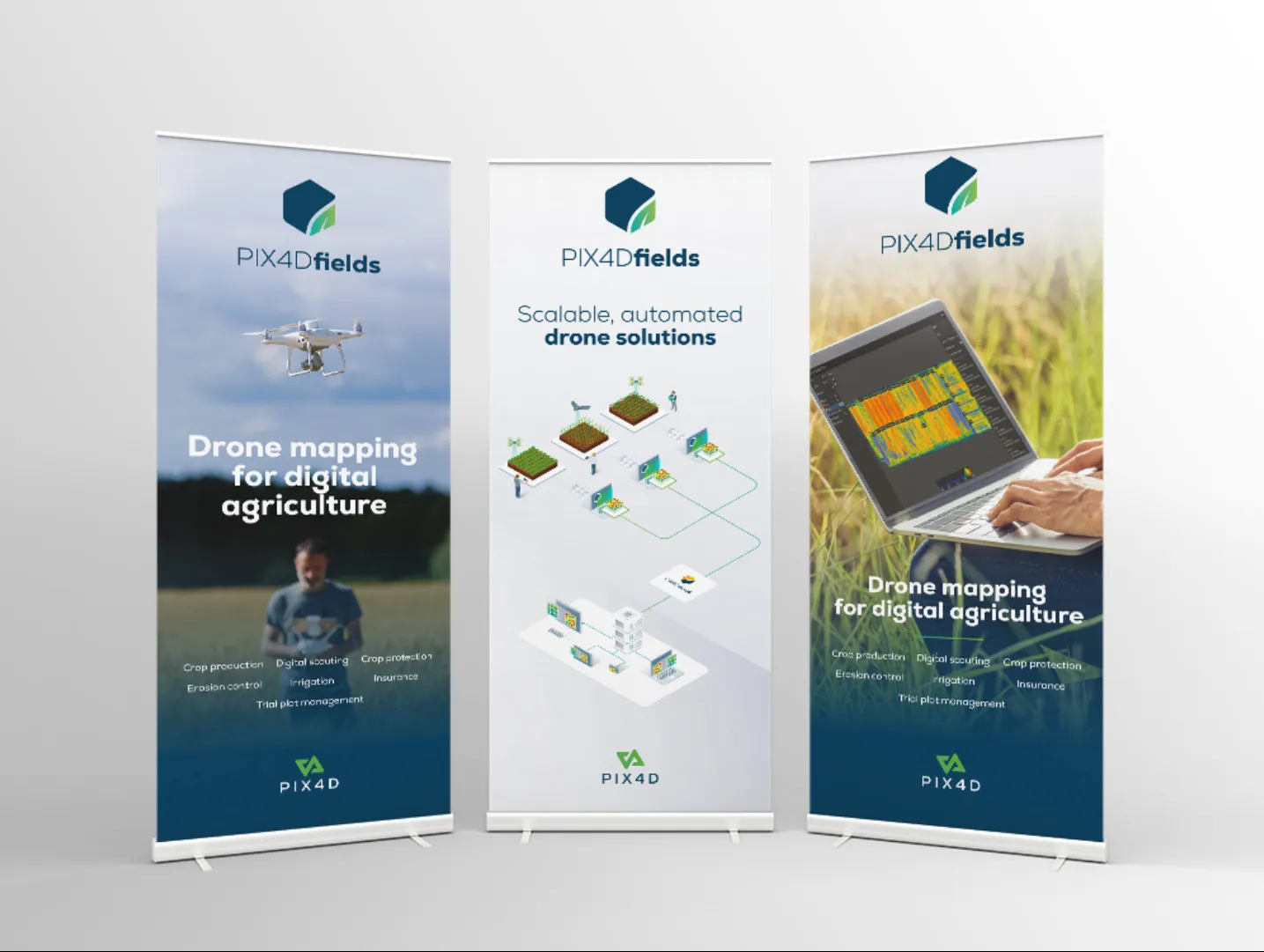
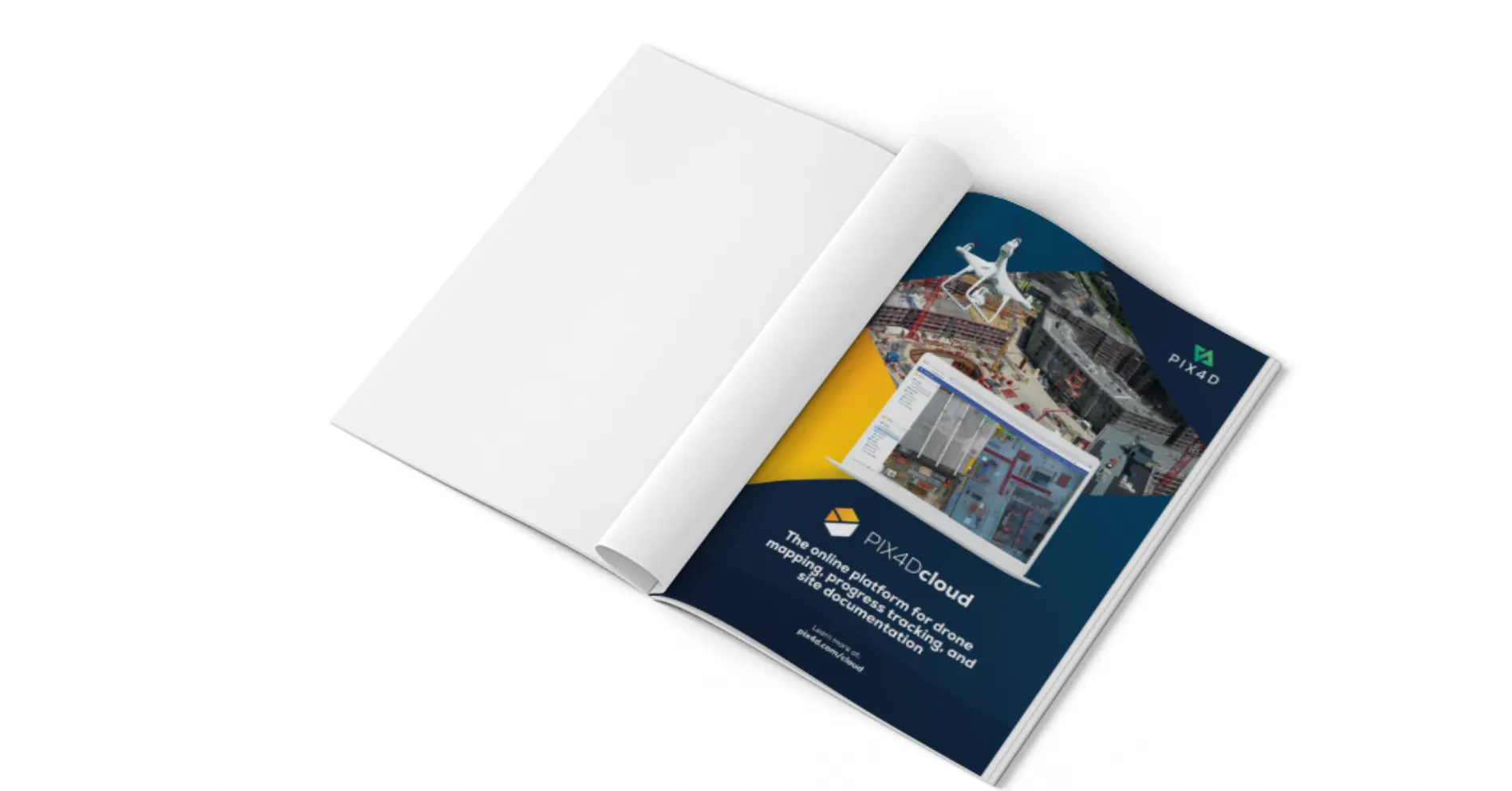
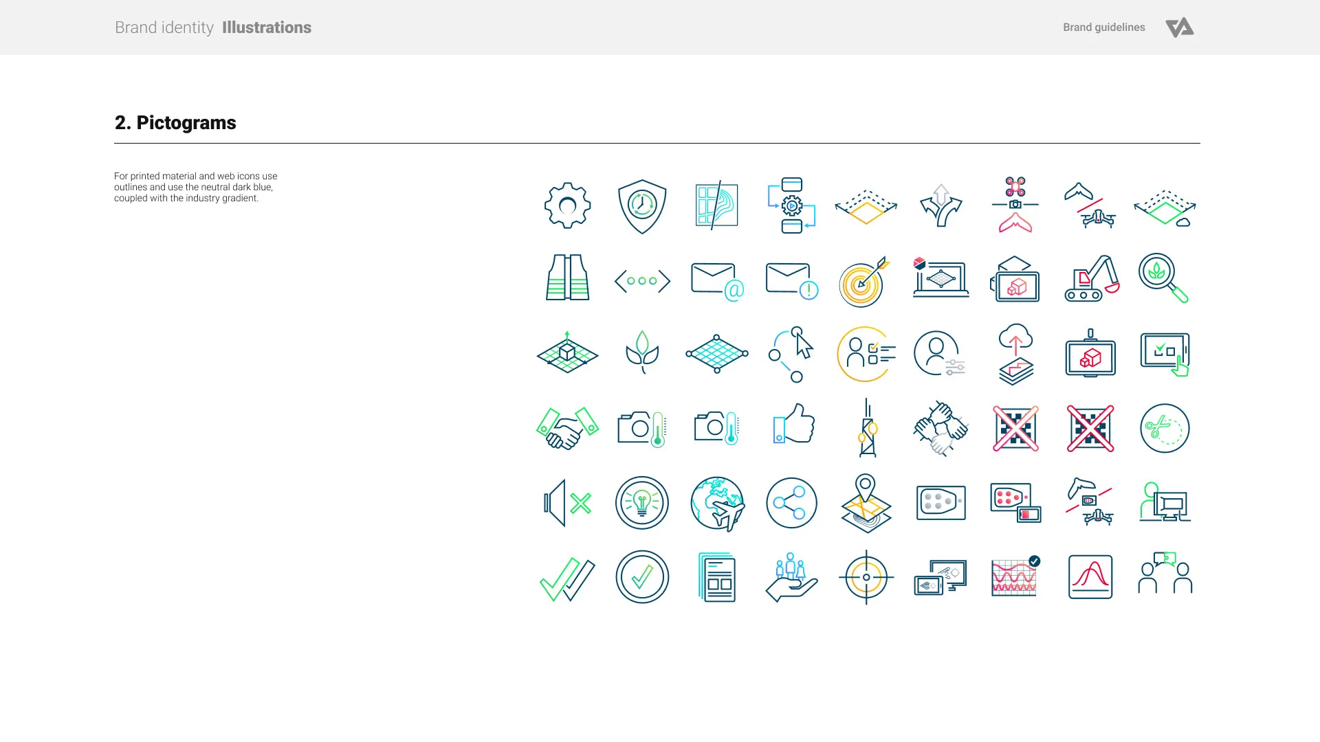
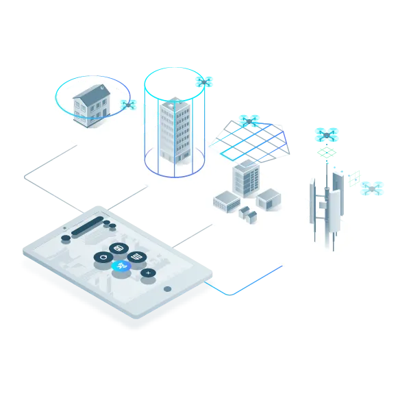
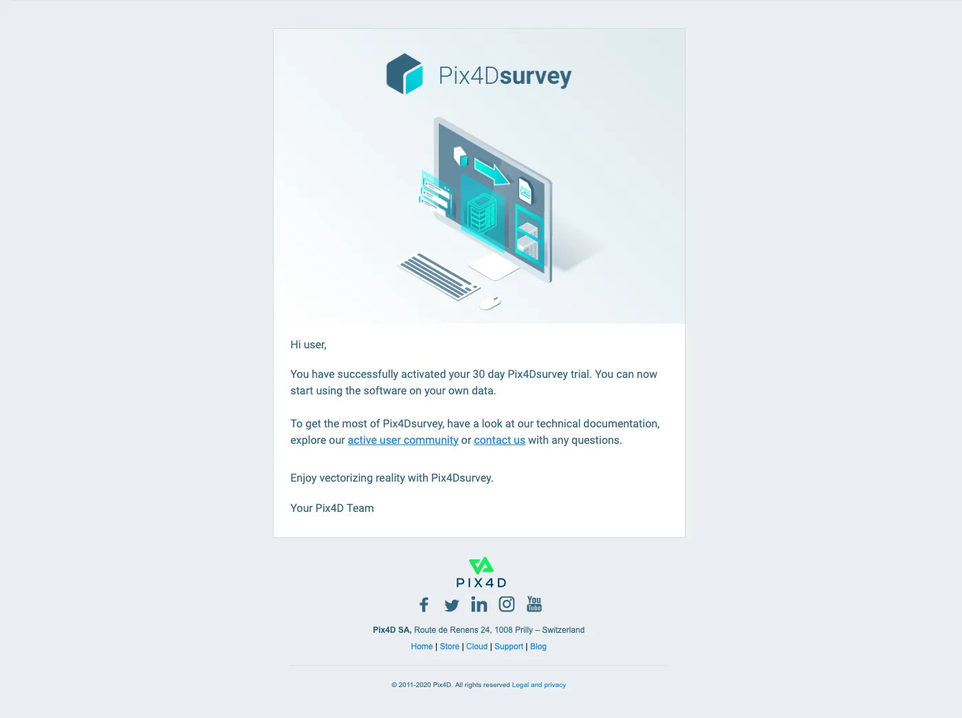
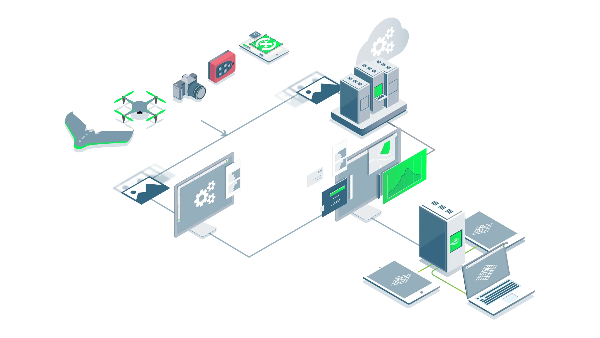
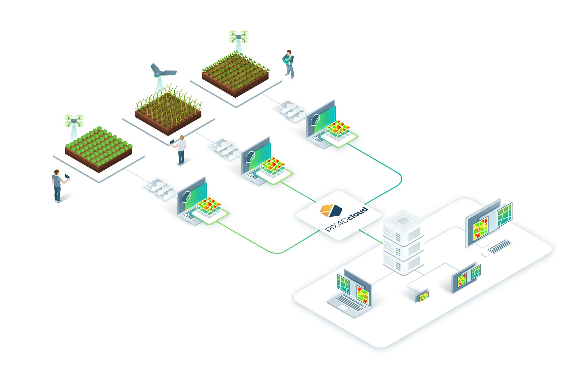
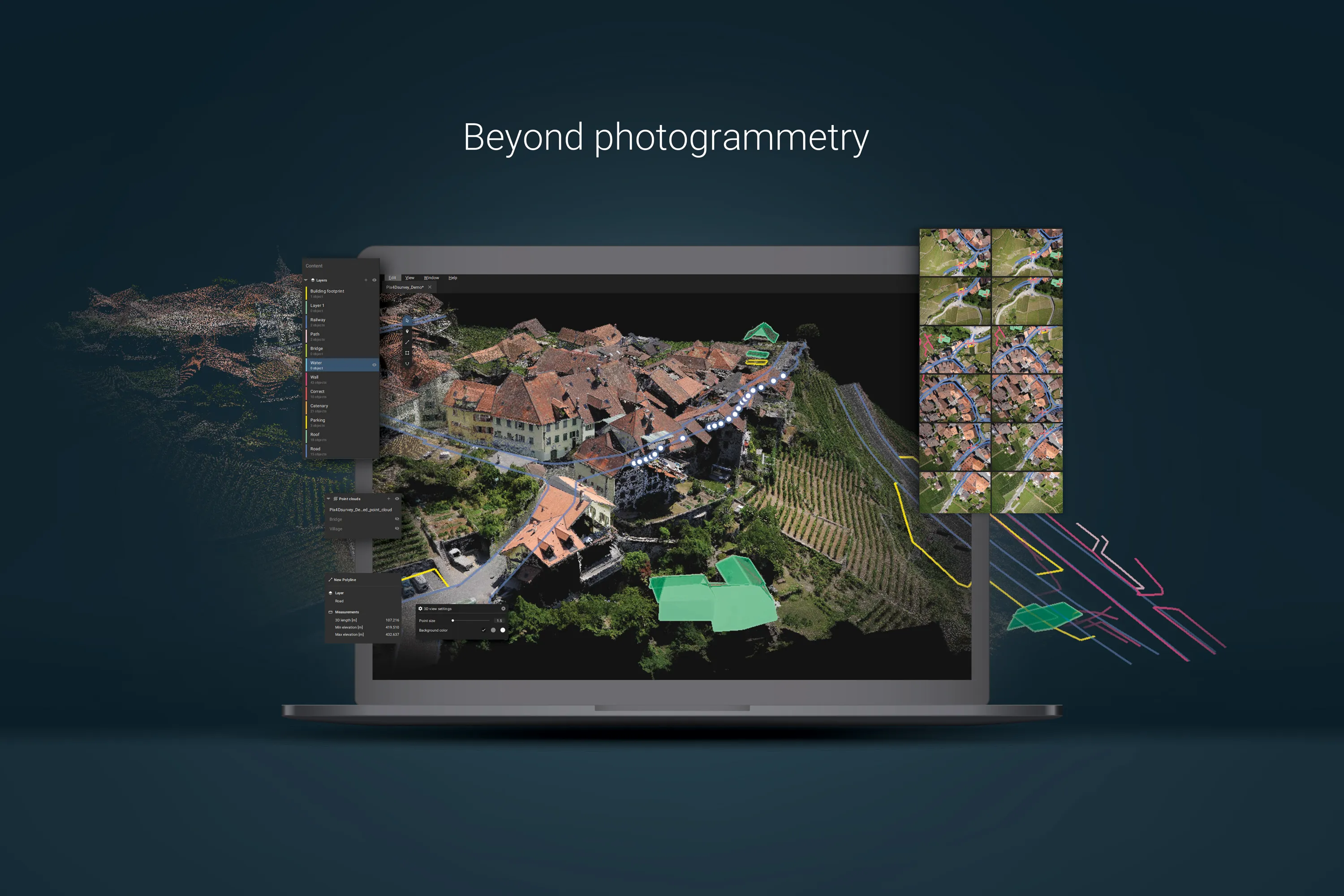
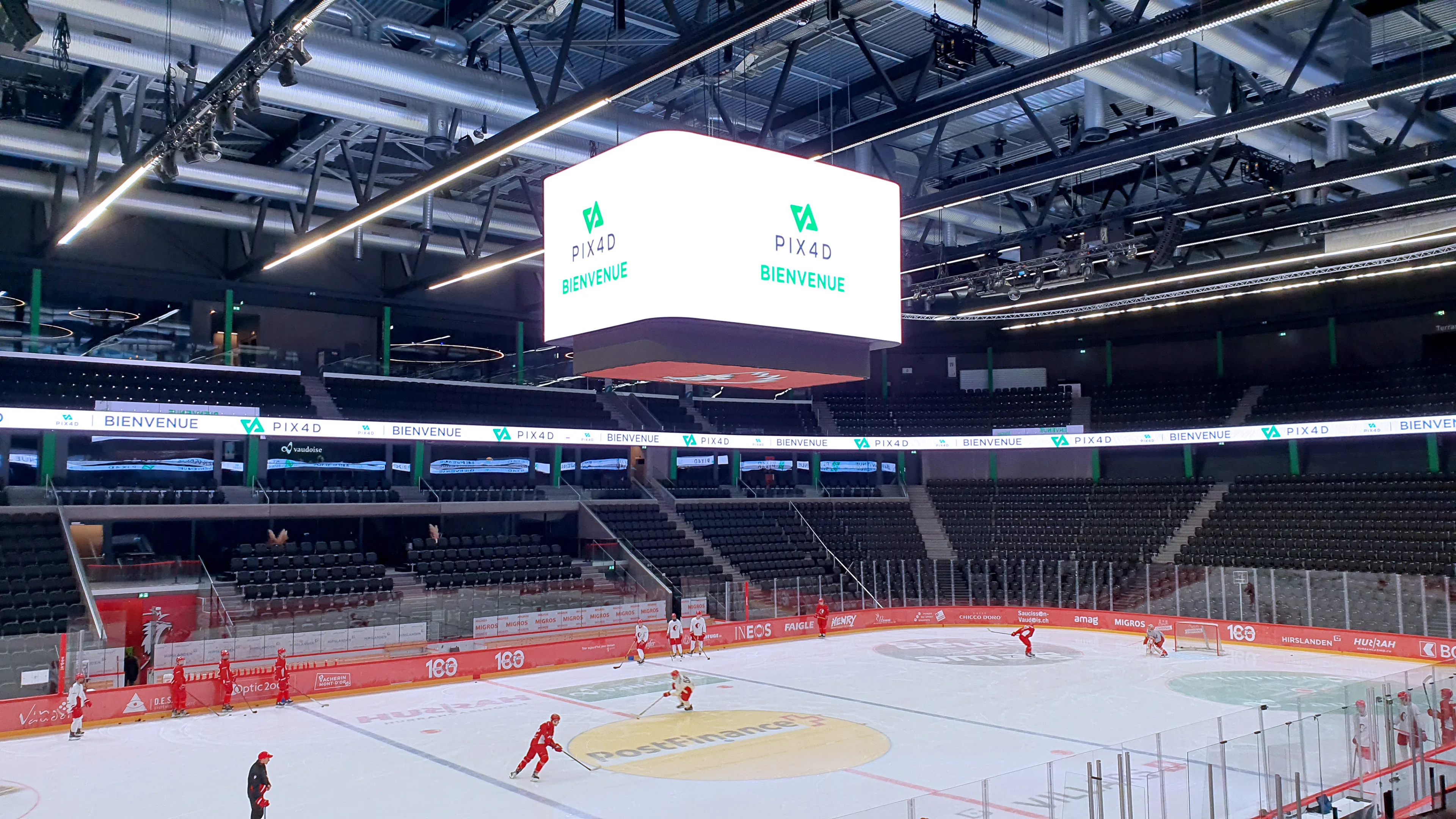
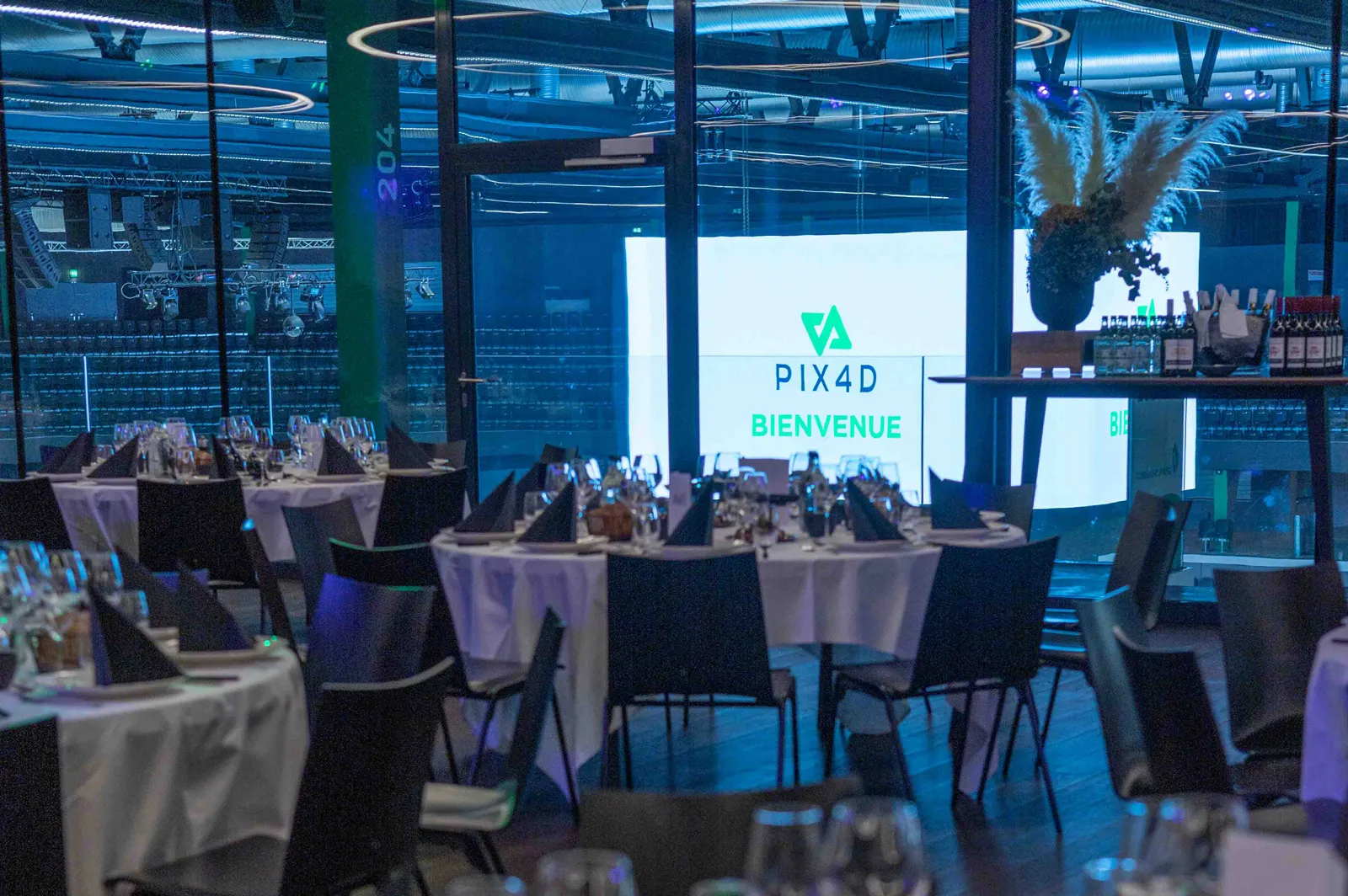
The rebranding extended far beyond just the logo work. I developed a comprehensive visual identity system to ensure consistency across all media and platforms — from print materials and digital interfaces to videos, social media content, tradeshows, swag, and the corporate website. This holistic approach allowed the brand to communicate with clarity and cohesion across every customer touchpoint.
This rebranding not only improved usability and recognition but also laid a strong foundation for Pix4D’s future growth.
SOCIAL MEDIA

















EVENTS











PRINT

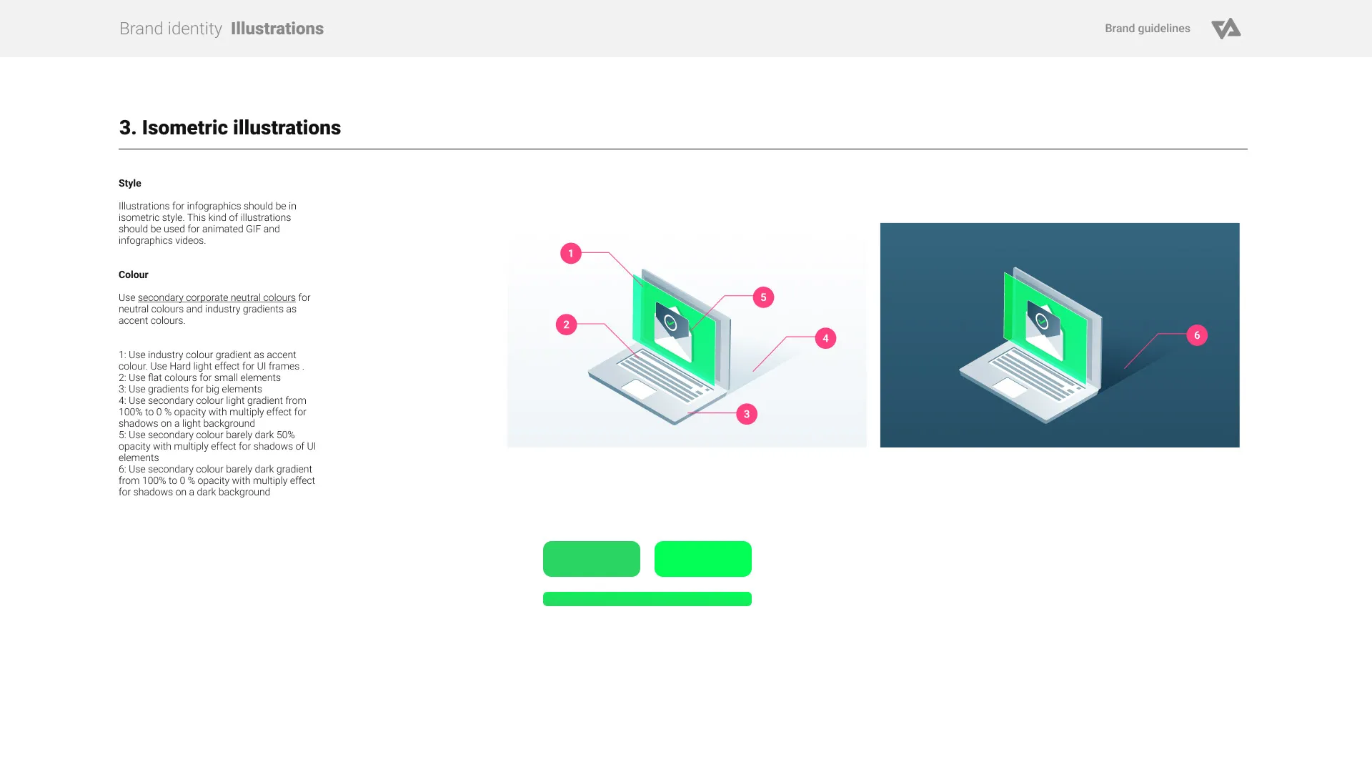
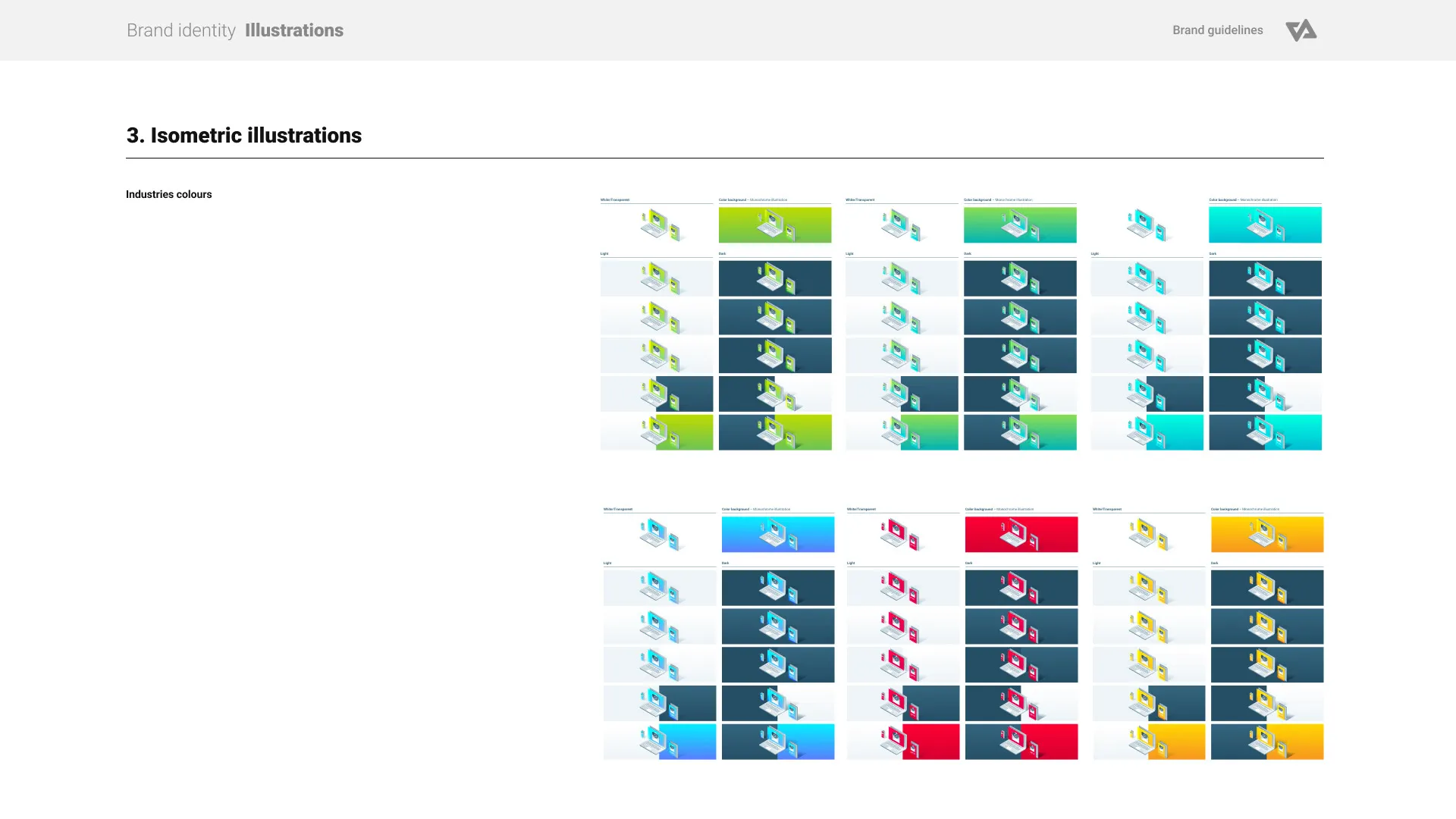
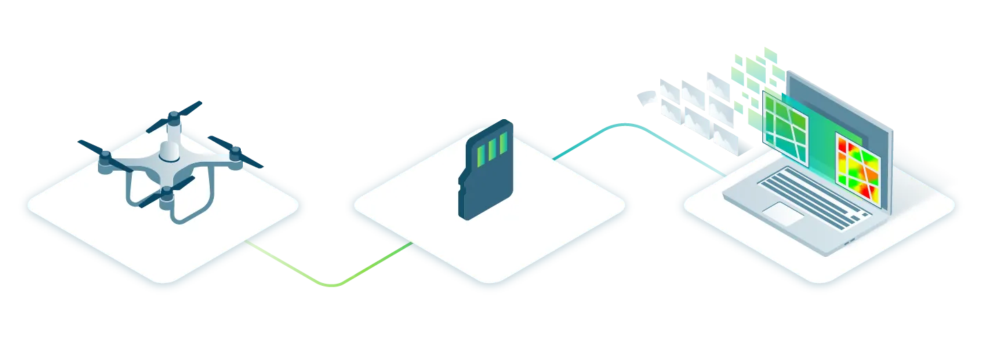
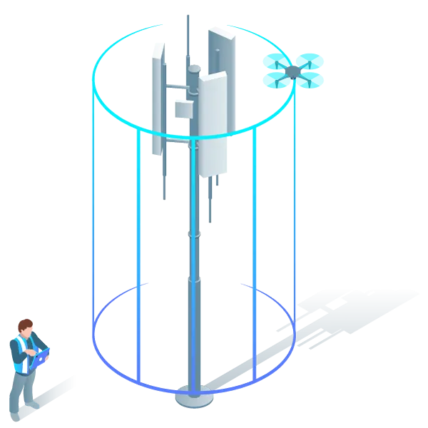
ILLUSTRATIONS



CYBER MONDAY








MISC
VIDEO